Quantcast
Channel: Maggie Knows Makeup
Viewing all 186 articles
Browse latest View live

Makeup Organization: Hygiene Station and Makeup Brushes

$
0
0
Despite appearances to the contrary, I'm actually not a naturally neat person. It's a running joke both at work and at home that I leave a trail of chaos behind me, and I can be found by following the detritus of a dozen or so half-finished projects (and ice cream bowls) scattered about. One of my dogs has wolfed down more than one errant sock I've forgotten to put away (even though somehow its mate managed to find its way to the hamper).

My brain is Pisces-typical: non-linear, unmoored and tangential.

And yet, somehow, I'm also an organization freak. I get a dopamine rush from the sorting process. I get excited about storage boxes the way some people get excited about Disneyland. I'm always looking for a better way to store and display the things I love.

And then that just goes up to eleven when the Spring Cleaning bug hits. Last week that meant tweaking part of my vanity, specifically my hygiene and brush organization and storage.

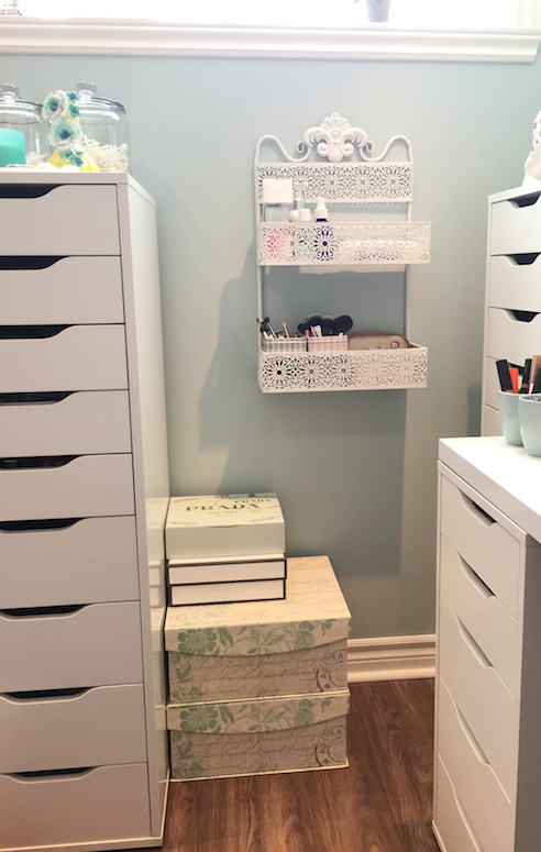
With the way I've set up my Alex units to form my vanity, I ended up with a blank wall to one side. It looked a little bit awkward, and struck me as a waste of space, but I couldn't figure out what to put there considering the space restraints created by the dimensions of the units and the space taken up by open drawers. I then came across some storage boxes (see?) and a cute little metal rack at Homesense, and inspiration struck. Up until now I had my extra makeup brushes and hygiene supplies in a cabinet on the other side of the room, and I figured having everything set up closer to the actual vanity would be more practical. And now I finally had a way of making that set up aesthetically pleasing as well.

I asked Androo to shimmy the vanity over to the right by a couple of inches to create enough clearance for the drawers, and then he kindly put the rack up for me (god, I love that man). I then stacked the two storage boxes below (again, with enough clearance for the drawers of the Alex unit to open), and also added old tea set and perfume set boxes for extra storage.

(The big glass mason jars on the Alex unit to the left are where I keep q-tips and cotton pads.)


Makeup Organization: Hygiene Station and Makeup Brushes


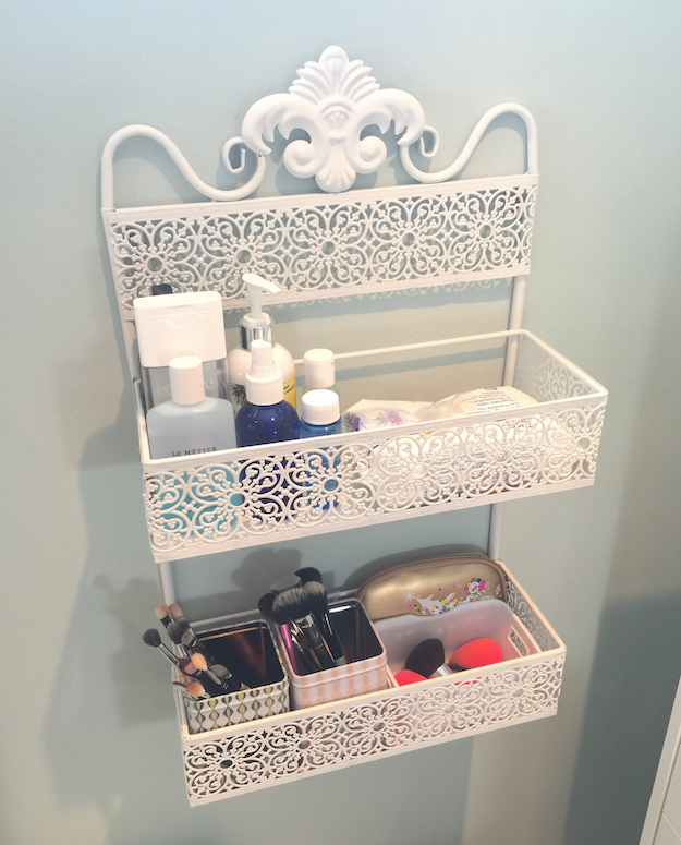
The top shelf of the rack is where I now keep my "cleaning" supplies: alcohol in a glass spray bottle, various makeup removers, spot brush cleaner, makeup wipes, hand cream (because alcohol is drying).

The bottom shelf contains little bins for makeup brushes and sponges that need to be washed. Instead of putting dirty brushes back into the jars on my vanity (to take up space and fester their bacteria on the clean brushes), they get popped in these bins, and then I can just grab one and go to the sink with it. This way I also don't get overwhelmed with the amount of brushes that need washing, as I can do a bin at a time and rotate them back in.

(The little gold pouch contains my travel set of Shu brushes, simply because it wedges neatly in that little space behind the bin.)

Makeup Organization: Hygiene Station and Makeup Brushes

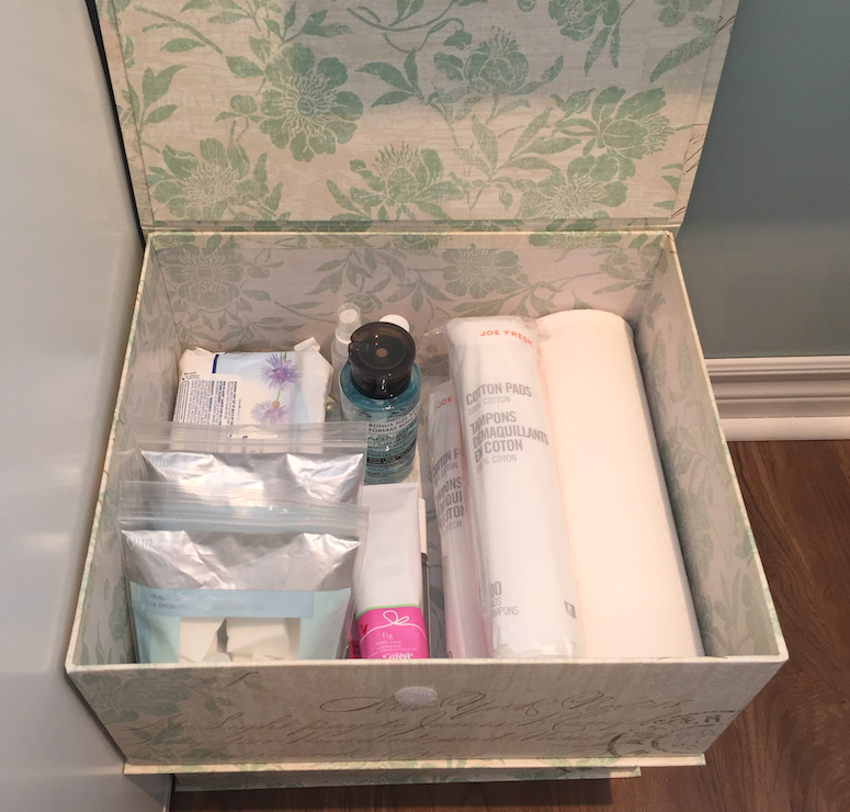
In one of the new storage boxes I have backups of wipes, sponges, cotton pads, paper towel and makeup remover. (The other box on the bottom contains PR info sheets and such, since it's something I like to keep for archival/reference purposes but don't need constant access to.)

Makeup Organization: Hygiene Station and Makeup Brushes

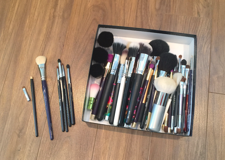
And then it was on to the brushes. As I was pulling them out of the cabinet, I realized that I really needed to do a sort and purge before organizing them, otherwise I would be doing unnecessary work. (I debated filming a video, but it was honestly too boring and fast of a process to merit it.)

These are the ones I decided to keep, grouped together roughly by function. These passed the test because they are backups of brushes I rotate regularly (eyeliner brushes, powder brushes), or brushes I use less frequently but still like to have on hand (the Smashbox bronzer brush - that red lacquer handle is everything - the Glamcor finish brush). 

Before putting each brush back into my collection, I asked myself whether 1) it was good quality and 2) a truly useful brush and 3) a brush that would rotate to my vanity regularly.

Makeup Organization: Hygiene Station and Makeup Brushes

These are the brushes I parted with. Some where just cracked and otherwise broken (on the floor on the left) and went into the trash. The rest were brushes that didn't pass the criteria. This was especially the case for brushes where I had better quality options.

I found that I almost all of my Sigma brushes failed by that measure. Aside from the paint peeling from some of them, the bristles felt a lot rougher than I remembered, particularly in contrast to the brushes I'd recently invested in. I don't think they're good quality brushes, honestly, and they don't hold up well over the years. Thanks, youtube, for suckering me. *fistshake*

I also passed on the majority of my Coastal Scents and Crown brushes, and some Sonia Kashuk ones from a set that didn't pass muster or where just not ones I see myself using.

All of these have been cleaned and re-homed with the the daughter of a friend.

Makeup Organization: Hygiene Station and Makeup Brushes

I didn't do any major re-organizing of my vanity, but I figured an overview of how I have it set up might be nice?

This is where I keep my skin prep. The cake stand (from Chapters) has some of the moisturizers and toners I currently use (minus the Embryolisse, which I had just used). The little teal bowl (from Anthropologie) has some samples I'm trying out. The two white bird bowls (also Chapters) have my clean beautyblenders and assorted bits.

Makeup Organization: Hygiene Station and Makeup Brushes

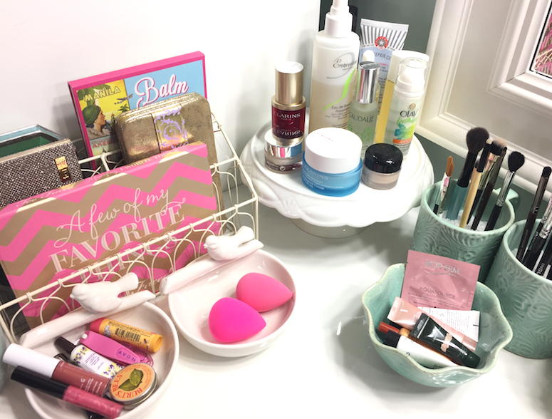
These are the same jars I've had for a while, which are technically coffee mugs and flower pots, again from Chapters. I swapped out the dry rice for polyfill from Michael's, because I got paranoid about bugs. :P

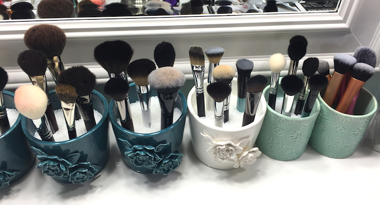
I have them sorted by function, best as possible:

Concealer and lip brushes, eyeliner and detail brushes, laydown and buffing brushes, cheek and blending brushes...

Makeup Organization: Hygiene Station and Makeup Brushes

Natural hair powder brushes, synthetic powder brushes, foundation brushes, highlighter/contour and precision powder brushes. And then all the Real Techniques in a mug without polypill, because their chubbier bases kept scattering all the beads when I pulled them out, which was making me INSANE.

Makeup Organization: Hygiene Station and Makeup Brushes

I would say the majority of my brushes in rotation right now are MAC, Zoeva, Glamcor, and Real Techniques, with some scattered in from Sonia Kashuk, Senna, Hakuhodo, Marc Jacobs, Chikuhodo, London Brush Company, Inglot, Wayne Goss and Cover FX.

I did just purchase a few from the Walmart brand synthetic line to try out, but since incorporating a few really high quality brushes recently, I think my future purchases are going to be investments. I hate being a douche-y snob, but there really is no comparison between a higher-end Japanese-made brush and the mid or lower end equivalent in terms of application and the feeling on the skin. Especially with natural hair brushes.

So that's it for now! Let me know if you want me to continue with these kind of posts. :)


Kat Von D Innerstellar Palette

$
0
0
Purchased item.

So at this point I pretty much auto-buy anything Kat Von D. There have been some misses, certainly (the mediocre Holiday palette, the underwhelming lipstick re-launch), but more often than not, I dig it. And honestly, KVD herself is growing on me, even though she has had some equally unfortunate missteps (see: her gross affair with Jesse James, the "Celebutard" controversy). She just seems so grounded and actually sweet in her tutorials, and genuinely passionate about her brand. Her instagram is also chock-full of interesting bits about art and literature, which is not at all what I had in my head about her.

ANYWAY.

On to the Interstellar palette (55$ CAD at Sephora).

Kat Von D Innerstellar Palette

Kat Von D Innerstellar Palette

Kat Von D Innerstellar Palette

Pretty, right? I love the groovy packaging design, and I was drawn to the cool-toned, neutral-leaning shades, balanced by a glimmery lilac and vibrant eggplant purple.

Kat Von D Innerstellar Palette

Kat Von D Innerstellar Palette

Performance-wise, most of the shades are spot-on with the quality I've come to generally expect: soft, creamy, not overly dense, but well-pigmented and blendable, lasting a work day over primer without fading. But there are a few exceptions.

The most iffy shades are actually in the first "quad" in the palette. The ice pink being a bit sheer and powdery, so while it's not a shade that I'd apply over a larger area, it works for the tear duct area, and has enough iridescence to add a duochrome flash to a colour layered underneath. The cool taupey/plummy brown is great, an easy satin-finish shade that's perfect for the crease. The shark-grey is maybe a bit sheer as well, but otherwise lovely.

The purple, however, was my biggest disappointment. It has super choppy payoff, and fades out like you wouldn't believe. To get it to show up on the eyelid, I had to use primer AND concealer AND a setting spray to wet the brush, and it still showed up more ashy than it does in this swatch. If you're buying the palette with this shade in mind, don't. There are definitely better options out there.

Kat Von D Innerstellar Palette

But then if you're in it for the cool neutrals, you have some great ones in the middle quad. All of these are beautifully textured. LOOK AT THAT PEWTER. The lilac is gorgeous as well, especially layered over the gray.

Kat Von D Innerstellar Palette

The final quad is good too, with the vanilla satin being the weakest, but for a brow bone shade it's actually just right, as it blends out the transition shade without adding extra frosting. The shimmery taupe is perfect, and the silver is out-of-control pigmented, definitely the richest feeling shade as well. The black is about average, pigmented but a touch choppy, but nothing daunting.

Kat Von D Innerstellar Palette

The purple fail and a couple of quibbles aside, this is a sweet little palette that could fill a hole in your collection if you need cooler tones, especially those mid-toned crease and transition shades (seriously, FOUR taupe/medium brown shades here, albeit all with different textures and finishes).

It's probably not one I'd recommend as a starter palette (not quite enough variation, since everything leans to one side of the spectrum, and heavily favours the medium shade range), nor would I urge the serious makeup aficionado to prioritize it, since they'd probably have these types of colours already. If you're a KVD collector, on the other hand....well, I don't have to convince you, since you probably already do have it.

My personal feeling is that I probably loved it a lot more initially, but that bust up with the purple broke my heart a bit. That said, I do find myself reaching for it quite a bit when I'm looking for that perfect crease colour.

I have a couple of looks here to show you how it applies. The one on the left is a typical cool-toned, work-appropriate, classic eye look, which this palette is perfectly suited to. (I've also rocked out a fantastic grungy, silver smoky eye with it.)

The picture on the right was my attempt to get the purple to show up with some kind of vibrancy (with grey contact lenses for some added contrast). I'm sure someone with more skills could put together a more flattering look, but it doesn't change the fact that's it's a righteous mess to work with, and actually started looking grey and faded within a couple of hours. (No such issues with the rest of the palette.)

Kat Von D Innerstellar Palette

Have you guys tried Interstellar or any of the other KVD palettes? What do you think of her line in general?

(I purchased this item. This post is not sponsored or otherwise compensated.)

Lise Watier Expression Spring 2015 Collection

$
0
0
Press samples.

By the time it actually feels like Spring, it's time to bid the seasonal collections goodbye. (Oh, Canada.)

So here's one last hurrah for the Lise Watier Expression Spring Collection, as summer waits in the wings.

Lise Watier Expression Spring 2015 Collection

The packaging on this collection was a vivid splash of colour, a bit of playing around on an artists palette (and totally connecting with the desire to see some bold, beautiful shades after a grey, dreary, never-ending season).

Doesn't this blush look like something you'd see from a plane, flying over the southwest United States? So pretty and original, but still graphic and unexpected (read: non-floral) for Spring.

Lise Watier Expression Spring 2015 Collection

Lise Watier Expression Spring 2015 Collection

Lise Watier Expression Spring 2015 Collection

The three different shades of the Expression Blush Trio (38$ CAD) are a little tough to separate out, and I tend to either focus my brush on the right side for a more coral-peach look, or more on the left for a warm pink.

The texture is soft and velvety smooth, and actually a bit powdery when picked up with a brush, but it looks very natural and texture-less on the cheeks. It has some sparkle in the pan and a bit swatched, but comes up as gently glowing on the cheeks. Very flattering, and almost more of a summer type colour, at least for me. It can be built up very easily for a punchier look over (faux) tanned skin.

Lise Watier Expression Spring 2015 Collection

Lise Watier Expression Spring 2015 Collection

Lise Watier Expression Spring 2015 Collection

The Expression Eyeshadow Palette (42$ CAD) just delighted me as soon as I opened it. Combine teals and olive greens, and you've made me the happiest camper. That said, I don't think this palette actually works all that well by itself, unless you happen to like pastel eyes. But it's perfect for integrating some much-needed colour and pairs well with the embarrassment of neutral palettes I have in my collection.

The formulation here is the same not-quite-cream-not-quite-powder that has been featured in the last few limited collections. It feels really plush to the touch, and some of the shades swatch especially nice, but I find the application can be a little tricky, at least as far as blending the colours together goes. Sometimes they don't buff out or build up particularly well (the mint green was particularly troublesome in this respect, remaining sheer and almost chalky), but they do look amazing once on the lids, with a glow that's not overly metallic or shimmery.

The teal and the olive are by the far the standouts in the palette, and I would easily buy those as singles. The mint is the weakest, as I said, and the peach is almost a little dry and faded when applied. The gold is oddly chunky, kinda thick to apply, but is works as a highlight.

Lasting power is average/good, maybe 7 hours before I see some fading (over primer).

This is a fairly simple but bright look using the palette, and a barely-there application of the blush. I managed to use all the shades on the eyes, going from yellow on the inner corner, through mint and teal on the lid to the outer corner, with the olive deepening the crease and smudged into the lash lines. I used the peach very lightly as a transition shade.

Lise Watier Expression Spring 2015 Collection

The summer collection is coming out soon, but these guys are still available at Lise Watier counters. (And if not, keep an eye out for the online warehouse sale in the fall, as past collections tend to pop up regularly.)

(Items were provided by the brand. This post is not sponsored or otherwise compensated.)

Ardency Inn Modster Manuka Honey Enriched Pigments

$
0
0
Purchased items.

I've had the Ardency Inn Modster Manuka Honey Enriched Pigments (24$ CAD) for a few months now and mentioned them in a haul video, but I thought that they might deserve a proper review, what with the Made With Love sale going on over at Sephora.

I'd heard a bit about this brand because one of my favourite makeup artists, James Vincent, is a brand ambassador. Paid spokesperson or not, James has a lot of integrity and I totally trust his standing up for this brand.

So I bought some of the eyeshadows (or pressed pigments, technically), and I am NOT disappointed. These are freaking phenomenal.

Ardency Inn Modster Manuka Honey Enriched Pigments

Ardency Inn Modster Manuka Honey Enriched Pigments

I know that honey is a natural humectant, though I'm not sure how well that function is preserved when it's integrated as an ingredient in a pressed powder formulation. I will say that these are incredibly creamy to the touch, with a rich, smooth payoff that isn't too thick. They have a very playable texture, so they're easy to work with, blending almost by themselves.

The copy claims that these have up to 78% pigment and high grade silicone waxes for long-lasting wear. I do think the pigmentation is fantastic, especially for the shades I've selected (there are a few that are more sheer with a sparkly finish, such as Disco). And over a primer, I didn't have any issues with fading or creasing for over 10 hours, if not longer.

The actual colours are awesome as well.

Rose Gold is a slightly "dirty" variation on the theme, so it translates well to a more deconstructed, rocker look, as opposed to something necessarily pretty and polished.

Peacock is one of those teal/red-brown ducochromes that I had to get, even though I own several iterations of the theme. I will say the green in this is much deeper and emerald-like than in any of the other eyeshadows I have.

Hell is really complex and hard to define - sort of a khaki grey-brown with a slight red undertone? It's insane. And fabulous.

Royal is what I'd consider a "hot" violet - purple with deep pink and blue undertones, and super intense. It has a thinner texture than the other three shades here, but it doesn't lack in the pigment department. If you're looking for a purple that maintains its vibrancy and doesn't wind up looking murky, this is it right here.

Ardency Inn Modster Manuka Honey Enriched Pigments
Rose Gold, Peacock, Hell, Royal.

Ardency Inn Modster Manuka Honey Enriched Pigments
Rose Gold, Peacock, Hell, Royal.

And how they look actually applied: I used Rose Gold in the inner two thirds of the lid and the inner half of the lower lash line, and used Hell through the crease and the outer third of the eyelid and outer half of the bottom lash line. Super simple, a little grungy, but still chic, I think. They blended perfectly, I really didn't have to do much work here.

Ardency Inn Modster Manuka Honey Enriched PigmentsArdency Inn Modster Manuka Honey Enriched Pigments

Here I just added a plum liner from Tarte to the bottom lash line, and slightly intensified the crease color.

Ardency Inn Modster Manuka Honey Enriched PigmentsArdency Inn Modster Manuka Honey Enriched Pigments

(The other makeup worn: Clarins Everlasting Foundation in #105 Nude, Essence All About Matt! Powder, Make Up For Ever Pro Sculpting Duo #1 (bronze shade), MAC Redhead MSF, Make Up For Ever Smoky Lash Mascara, Burberry Kisses Lipstick in Blush. Reviews coming soon for some of these items as well!)

Have you guys tried the Ardency Inn line yet? I really want to pick up more of the eyeshadows, but I'll probably wait for the next Sephora sale in the Fall. I can't say I'm super intrigued in the other products in the line, though. Maybe the foundation (which is a concentrate that can be mixed with other mediums), but I have a feeling Cover FX probably nailed the concept better.

(I purchased these items. Not sponsored or otherwise compensated.)

Burberry Kisses Lipstick - #77 Blush

$
0
0
Press sample.

What's better than one makeup miracle? TWO makeup miracles. In this case, Burberry is finally available to Canadian buyers via the (relatively) accessible Hudson's Bay website (and presumably certain retail locations), and, almost more importantly for many people, the newest addition to their makeup line is completely fragrance free. (I'm not personally that bothered with scented makeup, but it's definitely a know skin irritant so kudos to them for removing that issue. Here's hoping they continue with the trend.)

But onto the actual product.

The Burberry Kisses Hydrating Lip Colour (36$ CADclaims to feature a weightless gel texture, with a buildable formula and 6 hours of wear and hydration. I think it hits most of those marks square on.


There's some fancy ingredient chatter in the copy as well, regarding "shiny polymers" and "tea, lavender, and rosehip", which all sounds very nice, but won't mean much if they don't nail the actual performance piece of the formulation.

In terms of the weightless and buildable claim, Burberry aces it. The gel formula delivers on an extremely lightweight feeling on the lips, and the lipstick just glides without getting stuck in lip wrinkles. It doesn't have the smoothing or plumping qualities of its more buttery brethren, but it sits so light and seamless on the lips that it truly feels like you're wearing nothing at all. With one swipe, the pigment is even but slightly translucent, and deeper on the second swipe. It doesn't have the full-on opacity of a rich matte, but it's definitely buildable coverage. The finish is a soft satin shine that looks natural and pretty, without being overly glossy or goopy.

Hydration claims for lipsticks tend to be a bit overwrought, and I would say it's no different here. I don't get balm-level hydration, that's for sure, but this is a comfortable lipstick to wear. I can't test the 6-hour claim adequately, since I'm not likely to pass up eating for that long, but I didn't notice any significant fading or weird wearing away from application to my next meal. It just kind of settles on the lips and hangs out, doing its thing, until you realize a few hours later that your lipstick still look nice, if less shiny.

I don't know if this is a truly unique formula, but to be honest I don't think I've come across anything with this kind of gel texture that wears this well. If you're looking for something easy to wear for the summer (and the buttery-type lipsticks feel too heavy or goopy) but that still looks polished, this may be worth checking out.

And the packing is, as always, Burberry perfection. Elegant and weighty, with those little details (Burberry checks, magnetic closure) that make the price tag a little less outrageous.

Burberry Kisses Lipstick - #77 Blush

I was able to try the shade #77 Blush, which is a perfectly polished, office-appropriate, but still totally pretty, rose.

Burberry Kisses Lipstick - #77 Blush

Burberry Kisses Lipstick - #77 Blush

For a better look at how this lipstick looks IRL, I'm wearing it in the Ardency Inn review post.

So are you guys excited about Burberry finally being available at Hudson's Bay? I am, but I'm even more hopeful that this means HB is FINALLY going to step up their beauty department and online shopping experience to be competitive with Nordstrom and Saks.

(This item was provided by the brand. This post is not sponsored or compensated.)

Urban Decay Sheer Revolution Lipstick - Sheer Ladyflower and Sheer Obsessed

$
0
0
Press samples.

The Sheer Revolution Lipstick (26$ CAD) range from Urban Decay has been out for a little while, but I just recently got to try a few shades: Sheer Ladyflower and Sheer Obsessed. I've been pretty obsessed with either straight up balms or more opaque cream finish lipsticks, so these weren't high up on my radar. I'd heard good things, and I was probably going to snag a few, but I wasn't storming the gates for them. 

The more fool I.

Urban Decay Sheer Revolution Lipstick - Sheer Ladyflower and Sheer Obsessed

Urban Decay Sheer Revolution Lipstick - Sheer Ladyflower and Sheer Obsessed

The packaging is similar to the regular Revolution Lipstick, with a fluid and relatively weighty metallic bullet casing, this time in a violet chrome as opposed to pewter.

Unlike the bulky packaging that UD tends towards when it comes to their palettes, this is all sleek and chic, but still totally modern and cool. I feel cool carrying this in my purse. :P

Urban Decay Sheer Revolution Lipstick - Sheer Ladyflower and Sheer Obsessed
Sheer Obsessed and Sheer Ladyflower
Urban Decay Sheer Revolution Lipstick - Sheer Ladyflower and Sheer Obsessed
Sheer Ladyflower and Sheer Obsessed
The formula is exactly as the name indicates, a sheerer version of the Revolution lipstick. Where those are creamy, rich and fairly pigmented, these are slicker, lighter and more translucent. In terms of thickness of texture, they fall somewhere between the Estée Lauder Pure Color Envy Shine and the Lancôme Shine Lover lipsticks. They're super comfortable to wear, and though they have that slippy texture, I don't feel like they slide around on the lip. They actually have a bit of drag when applied, which surprised me. It doesn't make them difficult to apply, though, and actually helps keep to the contours of the lip without smearing around.

I wouldn't say they're particularly hydrating, but again, comfortable feeling. They're quite shiny, almost juicy initially, but that settles. Wear time is minimal, however. I don't think I've gone longer than an hour and half without needing a touch up, so be warned that you may be going through that tube pretty fast.

These didn't settle into lines or emphasize dry patches, and had the nice effect of smoothing out the lip slightly, either due to the shine or the more balmy texture.

Urban Decay Sheer Revolution Lipstick - Sheer Ladyflower and Sheer Obsessed
Top to bottom: Sheer Obsessed and Sheer Ladyflower
Sheer Obsessed is described as a candy pink, and it's definitely a light, cool toned pink with a milky/pastel tone. I don't think I would have ever thought to pick up a shade like this, as I would have assumed it would look too light or chalky. I think the translucency keeps it from looking stark. It almost has a bit of a lilac tone to it against my skintone, and it's just an awesome shade for spring.

Urban Decay Sheer Revolution Lipstick - Sheer Ladyflower and Sheer Obsessed
Sheer Obsessed
Sheer Ladyflower (LOVE the name, makes me think of that Medieval-set movie with Michelle Pfeiffer - Ladyhawke?), on the other hand, is exactly the kind of shade I would have picked. It's a cool-toned rosy pink, and again, super flattering.

Sheer Ladyflower
I'm wearing a mix of both shades here - Ladyflower first, dabbed nearly off, then Obsessed overtop. (Also some of the UD Moondust eyeshadows, review forthcoming.)


Have you tried anything from the Revolution range, either the original or the Sheer version? Are there any other sheer type lipsticks that you're currently crushing on?

(Items provided by the brand. This post is not sponsored or otherwise compensated.)

Make Up For Ever Step 1 Skin Equalizer - Redness Correcting Primer, Radiant Primer Yellow, Smoothing Primer

$
0
0
Press samples.
GWP at Sephora.
Contains affiliate link.

My first experience with primer was the classic Smashbox formula, and it turned me off primers for a loooong time. The thick texture and super slippy silicone texture felt strangely creepy and medical-grade (the product equivalent of Jeremy Irons in Dead Ringers *shudders*). Despite the way it disappeared once applied, my skin somehow still felt smothered. I've found others since then that I do love, and that are much more suited to my needs, but I'm still leery.

I also tried the old Make Up For Ever primers, and while they definitely had a more palatable texture - lotion-like rather than slippy - I can't remember being particularly blown away. I generally love MUFE as a brand, though, so I was hopeful about the recently relaunched version and jumped on the chance to test run a couple.

Make Up For Ever Step 1 Skin Equalizer - Redness Correcting Primer, Radiant Primer Yellow, Smoothing Primer

Make Up For Ever Step 1 Skin Equalizer - Redness Correcting Primer, Radiant Primer Yellow, Smoothing Primer

The major advantage and selling point for the Step 1 Skin Equalizer (43$ CAD) series is that the range addresses a variety of needs. Rather than billing one primer as a one-size-fits-all solution, MUFE has ten different options on the table - there's something here, theoretically, for every skin type, texture and tone. Better yet, they can be combined for optimal performance. (They suggest combining the redness correcting or radiance boosting primers before the mattifying or smoothing ones, and the  hydrating and smoothing before the correcting or radiance ones. My skin is a crazy topographical map right now, so I apply what I need in specific areas rather than layering them, but it's all up to you, which is the beauty of this concept.)

I've only tested three - the Redness Correcting Primer, Radiant Primer Yellow, and Smoothing Primer -  so I can't speak to how the texture of each primer varies, but these feel rather similar to each other.

The Radiant Primer Yellow and Redness Correcting have an identical texture: lightweight and a bit creamy, but with that disappears-into-the-skin finish that is the hallmark of a sophisticated silicone formulation. The Smoothing Primer feels a bit thicker, and reminds me of the Benefit Professional - which makes sense, since it needs to have a bit more weight to smooth down those pores and rough edges. It does a similar disappearing act, however, and bypasses that gross, overly slippy feel of the Smashbox type primers.

I would say the colour correcting is fairly subtle. (It's primer, not concealer.) The Redness Correcting does indeed tone down the redness, as does the Radiant Primer Yellow, to some degree. I do prefer the latter, however, as it also boosts the warmth in my skin, whereas the green tinge of the former emphasizes the olive tones. With foundation overtop, it's not a huge deal, and if you really prefer to negate the redness and aren't prone to looking sallow, the Redness Correcting Primer will probably be your pick.

The Smoothing Primer does reduce the appearance of my pores, and helps to minimize the texture of skin around blemishes. It's not quite photoshop, but it definitely helps to create a more even base for my foundation. It also mattifies slightly, though it doesn't control oil much better than any other primer I've tried.

What I especially like about all these primers is how smooth and soft my skin feels after applying them - not tight or flaky, like some primers can leave it feeling. All of them are excellent for getting foundation to apply super evenly, and it nudges up the time-frame for flake-free, shine-free wear.

Make Up For Ever Step 1 Skin Equalizer - Redness Correcting Primer, Radiant Primer Yellow, Smoothing Primer
Smoothing Primer, Radiant Primer Yellow, Redness Correcting Primer
And since it's hard to talk about the effects of a primer without showing some results, here's the stuff, on my face.

On the left, my bare skin, with some moisturizer that was applied about 45 minutes before the picture. I've been having some kind of skin reaction to skincare samples I was testing (waaaaayyyyy too many at once, hence The Red Spot of Rage).

In the middle, I have the Smoothing Primer applied to my nose, forehead and my inner cheek area. You can see the mattifying effect, and the way the pores are less obvious. The slight texture in my undereye area is also softened. I used the Radiant Primer Yellow on my cheeks, jaw and chin, and some of the redness is attenuated.

On the right, I've applied one layer of foundation (MUFE Mat Velvet, with a tiny drop of Ellis Faas to cut through the matte finish somewhat), with a bit more dabbed over the TRSoR. As you can see, the application is really smooth and even.

Make Up For Ever Step 1 Skin Equalizer - Redness Correcting Primer, Radiant Primer Yellow, Smoothing Primer

And the full makeup...

Make Up For Ever Step 1 Skin Equalizer - Redness Correcting Primer, Radiant Primer Yellow, Smoothing Primer

Are any of you trying these new primers out? What do you think? I'm quite tempted to give the Mattifying and Hydrating ones a go, down the line. In case you're thinking about making a Sephora order soon, you can choose between four deluxe sized samples with the code MUFESKIN (with a 35$ CAD minimum purchase, I believe).

(Items provided by the brand, aside from the GWP sample from a Sephora order. This post is not sponsored or compensated.)

Changes....

$
0
0
Androo hates it when I start my sentences with "I've been thinking...", as it usually means that he needs to move something for me, or build something. Sweetheart that he is, he has yet to say no.

Thankfully, this time the changes are squarely on me.

Ever since I posted my "Truthiness in Blogging", I've been thinking - A LOT - about what it is I've been doing over the last few years with this blog. (I took a bit of a break at the start of the year, thinking it was mostly a bit of burnout, but my underlying malaise never really went away.) More specifically, how I've been interacting with the beauty industry, with fellow beauty lovers - and how that all ties in with my own personal ethics.

After some really hard, critical thinking, I've come to some unpleasant conclusions. Namely, I've strayed rather dramatically from my centre, and have rationalized a pattern of consumption that I just can't justify any longer.

So I'm making some changes.

1) After a few more posts that I've already committed to writing (or have already half-written), I will no longer be updating this blog. I won't delete it right away, as I still have some attachment to what I've spent the last few years creating. I debated just changing the name and the format, but I think I need a clean break. I will still be blogging, with a shifted focus, over at http://asimplehedonist.blogspot.ca. 

2) The nature of beauty blogging is such that it encourages overconsumption. Considering the fiscal, environmental and personal impact, my goals going forward will be to simplify. I will be downsizing my collection in the coming weeks, and I will re-start my declutter series, with a more aggressive focus. I will be donating and selling those items, as warranted. 

3) Part of the disjointed feeling I've been having these last few months stems from the fact that I feel like a tremendous hypocrite purchasing from brands that have been tested on animals, while cooing over my own dogs and their adorableness. I haven't decided yet what to do with all the items I own from non-CF brands (there are a distressing amount), but going forward, I will be limiting my purchases to CF products. (If you are perchance also looking to go cruelty-free, this blog is an EXCELLENT resource: http://www.crueltyfreekitty.com.)

Seriously. Look at those faces.
I obviously still love makeup, and beauty in general, so whatever I continue to blog about will encompass that field. I just need to pare back the things that have become noise in my life, so that I can truly appreciate the things that are lovely and worthwhile. 

If you care to follow me, I will be setting up over here in a little bit: http://asimplehedonist.blogspot.ca


Declutter - Lip Things (AKA How I Failed At Getting Rid Of Goo)

$
0
0
And so it goes.

One thing I've realized doing this de-clutter: I have a wildly inaccurate perception of my reviewing capacity. I've pulled out so many items that I purchased (often in multiple shades) with the sole intention of reviewing - and they're still sealed, mocking my intentions with their plastic-coated goodness.

This is the pile of assorted lip products (glosses, stains, lipsticks) that are exiting my collection. I posted it on Instagram and got some lovely comments from people, very encouraging and congratulatory. Which I really appreciated, since I was depressed about how much time and money I've wasted.

makeup declutter organization lipstick lipgloss lipbalm

But...that pile is still barely a dent. I have a serious lip goo problem. Here's what's left...

First up - the lip balm and stain drawer. Grouped roughly by cruelty-free (the three trays to the right) and not (pretty much everything else), so when it comes time for Round Two of the decluttering process I can focus on the non-CF side more easily. (That's assuming I don't wind up drinking wine under my desk by the end of this, Sherbatsky-style.)

Side note: those Fresh balms are my favourite, and have been for years, but Fresh is not currently CF. I welcome suggestions for an alternative, since balm is one of those staples that I will have to replace eventually.


Next up is the lip crayon drawer. I pulled out all the Revlon ones that had yet to be used....and kinda threw in the towel after that. These things are so damn easy to use and carry around. I need moral fortitude to give more of them up. (Again grouped by CF/not CF, with the Revlon/Rimmel and Clinique/MAC being the only non CF ones.)


Oh god, the lipgloss. This is some serious goo, here. At least this was easy to parse out. Anything that was still sealed went into the potential sale/giveaway pile. A few things that were open but still new - and that didn't evoke a need to clutch it to my chest protectively - went into the "give it to my mom" pile.

Then there where all the ones that earned a sketchy look during the smell test. Those went into the "toss it" red bag in the picture up top.

And so I'm left with the CF drawer...


And the non CF drawer.


LISTEN, I KNOW. But it only gets worse. Following the same strategy as above...

....the CF lipsticks.


And the non-CF lipsticks.

(And yes, I know the Clinique ones are still boxed. I just bought them before I started this whole thing, and I can't make myself let go of them just yet. Because....reasons.)


WHY DO I HAVE SO MANY OF YOU?? WHY MUST YOU BE SO ADORABLE IN YOUR LITTLE BULLETS AND PRETTY COLOURS?

Also, is it time for wine?

The Sort of Intentional Makeup No-Buy

$
0
0
Somehow, without really trying, I wound up doing a no-buy these last few months.

Going cruelty-free helped, certainly, since I couldn't just pick something up on a whim. I wanted to research the brand's status, which meant first checking their own website for either outright statements or signs of weasel-speak, and then cross-referencing with the two or three online sources I trust. By that point, I often found myself moving past the initial OMG I MUST HAVE IT emotions that have characterized my makeup shopping these last few years.

When I realized I was actually moving away from those urges, I decided to remove all sources of temptation. I unsubscribed from newsletters (SALES! EXACTLY LIKE LAST YEAR! ONLY SALE-IER! AND WITH MORE OF THIS !!!!!) and Youtube channels that drove my need for acquisition. I unfollowed brands and PRs on social media. I even stopped reading certain blogs, though I might adore the people behind them, because I needed to get out of that New! Shiny! Pretty! headspace.

And...it worked.

The last time I bought from Sephora was May 3rd.  

sephora makeup no-buy

Yeah, I'm thisclose to requalifying for Rouge. And at this point all I can muster for that "accomplishment" is a big ole shrug. I'm actually more perturbed that I spent 230$ a month on makeup. 

(That point status thing in the Sephora account may work against them, when people get a hard look at their purchasing habits. I looked at my number for last year, and nearly had a stroke. Especially when I factored in that Sephora only accounted for part of my makeup spending. Short story: I could have bought a car with the money I spent. Not a fancy one, you understand, let's say the 2008 economy version, but still...A FREAKING CAR.)

This is what's on my Loves list, which used to be several pages long.

sephora makeup no-buy

Both are from cruelty-free, quasi-vegan brands, and I'm totally fine waiting until the VIB sale to get them. And maybe not even then, because I have so much freaking stuff to get through first.

(Side note: Kat Von D is one of the few brand-related people I'm still following on Instagram, and holy hell is she ever awesome. I had this image of her in my head from the Jesse James scandal, and she is so far from that. Honestly, go check her out.)

I did also buy a set of Cozzette brushes (30% discounted on sale), which are vegan and cruelty-free, as I'm trying to replace and re-home my animal hair brushes. (Minus the two Japanese-made ones I own. Because I am weak.) 

cozzette makeup brushes vegan cruelty-free

Other than that, I haven't purchased any makeup or skincare, or really any beauty items since May 3rd. I did get some soap, toothpaste and natural deodorant at the end of May, but that's really it. It was much, much easier than I thought it would be, though of course I also have a huge backlog of products to lean on. And that really is going to be my goal going forward: to buy as little as possible, use what I have, and really narrow down my collection to those items that I really, truly love.

How are you guys doing with your beauty buys this year? If you're decluttering/downsizing, what do you find has helped you stay on track? 

Makeup Purge - First Pass Declutter

$
0
0
Since my last post on decluttering my lip products, I've gone ahead with all the categories in my collection. I knew, going through it, that it was only a preliminary declutter, and that I would really need to sit down and make some harder choices, but it was a good place to start.

This is a quick overview of the result.

Declutter 2016: Drugstore Palettes

Kat Von D Shade & Light Eye Contour Palette

$
0
0
Purchased at Sephora.
Affiliate links.

I love seeing women succeed, and Kat Von D has been killing it these last few years. Her brand started out smelling of a vanity project, but she's really made it into a stand-out, with an aesthetic that is both authentic and distinctive.

I'm not much into contouring, so the first iteration of the Shade & Light palette passed me by. I was much more enthralled with the Eye Contour version - even though I already had the Viseart 01, the OG of matte neutral palettes.

Kat Von D Shade & Light Eye Contour Palette

Kat Von D Shade & Light Eye Contour Palette

The packaging strikes a great balance between practical sleekness and gothic whimsy and I very much appreciate the shades being named both on the exterior box and on the back of the palette itself.


Random aside - from some of the pictures Kat has posted on her Instagram, I got the feeling that she was into some version of the occult. Usually the name choices in her brand reference music, art and literature, but this palette is definitely magickal in tone.

(Specifically, some of the shade names are those of demons listed in the Ars Goetia, one of the books in the Lesser Key of Solomon , while others are the names of archangels in Talmudic lore. Very fitting for something named "shade and light", and Kat gets a fistbump for working in references to a freaking17th century grimoire. )

Kat Von D Shade & Light Eye Contour Palette occult
Three Books of Occult Philosophy by Henry C. Agrippa
The Key to Solomon's Key by Lon Milo DuQuette

The palette itself is laid out in a user-friendly manner, with three functional "quads" - one more neutral, one cooler, one warmer. Each has a larger pan of a light base shade, a medium contour (or transition) colour, a dark defining colour, and a pale highlight colour. 

You can mix and match across the board, but the way the shades are arranged makes the palette very accessible for a makeup newbie trying to build a cohesive eye look. 

They very nicely include a guide on how to do all that:


There's also a very convenient mirror in the lid, something that's sometimes lacking in cardboard-style slimline palettes, and a magnetic closure.

Kat Von D Shade & Light Eye Contour Palette

Kat Von D Shade & Light Eye Contour Palette


The shades are matte, with the three palest having an incredibly subtle satin finish, barely perceptible as a sheen once applied.

Mattes are some of the trickiest formulations to nail. Pigmentation aside, the real secret is getting the texture right. Too soft, and they can blend away too easily, or be hard to layer with other eyeshadows. Too firm, and they can be difficult to lay down and build up.

These strike a near-perfect balance between smooth and dense. I had no issues getting these eyeshadows to do what I wanted them to do. Haze out a soft transition? Easy. Build up a serious smokey eye? No problem. Deepen a crease with perfect accuracy, or soften the edge of a winged eyeliner? Done and done.

If, like me, you were just "meh" about the face contour palette, you might be pleased to know that Lazarus (the grey brown transition colour) is aces for shading out some faux cheekbones.


Laetus - looks more yellow cream in the pan, but actually applies as a bone colour. Probably has the firmest and driest texture in the palette, and one of the sheerer applications. It's great, however, for dusting all over the lid after a primer or cream base to given an even base, especially if you're of a similar colouring to me. If you're deeper, it'll probably be underwhelming.

Samael - a neutral brown mid-tone, a true workhorse shade.

Solas - a deeper version of Samuel, wonderful for sculpting out the crease and the outer corner.

Lucius - a beige-tone off-white, I especially like this for giving a bit of lift to the eyebrow arch without adding shimmer.


Lazarus - a greyed-out, pale brown. Another workhorse shade, which on lighter complexions works beautifully as a face contour.

Saleos - a deeper, cool-toned brown, excellent for sculpting in those shadows. If you have dark hair but have a hard time finding an ashy eyebrow powder, this might work for you as well.

Shax - it's, well...black. Nothing much to say, except that it's very easy to work with. I love it for going over my wing liner to lock it in and keep it matte, and unlike some black eyeshadows, the formula doesn't smudge or drop down debris.

Liberatus - ever so slightly off-white, no chalkiness. I'm pretty "meh" on these kind of colours, so I mostly just wish it was shimmery, but it does what it does.


Ludwin - a hybrid of soft terra-cotta and melon, this is a shade I didn't realize I was missing in my eyeshadow wardrobe. It's perfect for saving a smokey eye that has gone all drab and tired looking, and I like to use it as my softest, most hazed out transition colour to build up an eye look. (When I'm fancy like that.)

Succubus - a muted brick with a bit of burgundy, this shade is especially stunning with blue and green eyes. Like Ludwin, a little of this smudged in the crease perks up a neutral eye look.

Sutry - a deep chocolate brown, a rich and lovely alternative to black.

Latinus - a warm creamy white, this one has the most sheen visible, as well as the richest pigmentation of all the highlighter shades. It's my favourite for that purpose, though it also looks very nice as a base all over the lid, brightening without being stark.

All in all, a very practical and beautiful palette. If Michelangelo was a) alive, b) really into contour, he'd have a field day using this thing to sculpt some faces. If I were to tweak it for my own personal liking, I would have given the highlight shades just a touch more sheen, but YMMV.

Andalou Naturals - Revitalizing Lash + Lid Makeup Remover, Blossom + Leaf Toning Refresher

$
0
0
Purchased items.

I suffered through terrible acne as a teenager, and have had fussy skin since then, so I don't tend to experiment a lot with my skincare, but I do like to try new versions of the kinds of products that work for me overall. 

Two categories that I'm especially into are 1) oil cleansers and 2) hydrating toners. 

My skin just doesn't tolerate foaming-type cleansers very well, getting drier, more fragile-feeling and more prone to breakouts the more consistently I use them. Oil cleansers, especially the kind that rinse off, are a better bet, though they're obviously not all created equal. Some tend to make me break out (sweet almond oil, you luscious-smelling bastard), and some have an overly aggressive emulsification that doesn't just rinse off the oil in the product, but my skin's natural oils as well (hello, Bride of the Mummy).

As for hydrating toners, I think they're just the most versatile product. Skin feeling pretty balanced? A spritz in the morning layered with a light oil on drier spots is enough to keep my skin fresh without adding the weight of a moisturizer. Need more help? Mix some more drops of facial oil with a spray of toner in the palm of my hand to make a light emulsion, and press into the skin for a beautiful, healthy glow. Skin looking like a vanilla pound cake after applying foundation? A few passes of toning spray and I look like a human being again. A toner loaded with skin-loving ingredients is my slinky black shirt - I can make it work for me in almost every circumstance.

So since I'm trying to find more "green" and "natural" ways of doings things in my life (while still making the grade in terms of being evidence-based), I decided to try a couple of those options from the brand Andalou Naturals. (This isn't a brand I was familiar with until recently, but I came across them on www.well.ca.)

Andalou Naturals - Revitalizing Lash + Lid Makeup Remover, Blossom + Leaf Toning Refresher


Andalou Naturals - Revitalizing Lash + Lid Makeup Remover, Blossom + Leaf Toning Refresher


The formulations sounded interesting, though the fruit stem cell thing is a bit of nonsense.

This is the claim the brand makes:

"Fruit Stem Cell Science® renews skin at the cellular level. Award-winning Malus Domestica (Apple) and Solar Vitis (Grape) Stem Cells provide ‘universal’ cells to energize skin cell function for enhanced immunity, longevity and vitality. Fruit Stem Cell Science® accelerates the skin’s own ability to repair and replenish health cells effectively replacing older, weak and damaged cells. These universal cells become activated skin cells and elasticity and resilience are restored."

Eh. Fruit stem cells sound like a perfect blend of green and science-y, but stem cells can't survive in a cosmetic formulation to do anything like what's being claimed here. It's possible that eventually stem cells will be used in skincare applications, but the research isn't there yet.

If you're inclined, you can read more about their claims here, but personally I give it all a big ole side-eye.

That said, they are full of other nice, effective things, including antioxidants and skin-soothing and skin-repairing ingredients.

Revitalizing Lash + Lid Makeup Remover: Aloe Barbadensis Juice*, Simmondsia Chinensis (Jojoba) Oil*, Glyceryl Stearate, Fruit Stem Cells (Malus Domestsica, Solar Vitis) and BioActive 8 Berry Complex*, Cetyl Alcohol, Glyceryl Cocoate, Biotin, Hyaluronic Acid, Ginkgo Biloba Extract*, Caprylic/Capric Triglycerides, Dipotassium Glycyrrhizinate (Licorice) Extract*, Rosa Canina (Rosehip) Oil*, Phenethyl Alcohol, Ethylhexylglycerin, Aspalathus Linearis (Rooibos), Hibiscus Sabdariffa and Camellia Sinensis (White Tea) Extracts*^ Non-GMO verified *Organic ^Fair Trade

Normally I wouldn't be too fussed about "fancy" ingredients in a cleanser (since the potential benefits are shortchanged by the length of time the product remains on your skin), but this is the kind of cleanser that gets massaged in for a while, so I'm willing to give them a bit more weight.

Jojoba is nice oil for facial application, as it's usually kind to reactive skin and the texture feels fairly luxurious in a formulation. Biotin is in here to supposedly boost your lashes, but I don't see it doing much of anything in this kind of application. The plant extracts in here are anti-irritants (liquorice) and antioxidants, and the rose hip oil is a nicely nourishing oil as well.

This is marketed specifically as a product for removing eye makeup, and they recommend applying it to dry skin, massaging lightly and wiping away with a cotton pad. Used this way, I found it only moderately effective. It got most makeup off, but didn't make much of a dent in my Marc Jacobs eyeliner, for example. I found it was a better when I added in a bit of water to emulsify, but only marginally. As such, I wouldn't recommend it to be used primarily as an eye makeup remover, especially if you tend to wear heavier, more waterproof makeup.

That said, I found it really lovely to use as either a second all-over facial cleanse in the evening, or as my morning cleanse, when I didn't have to worry about removing a ton of gunk. I found it left my skin fresh and soft, and not feeling stripped. I'm considering it as a replacement for my currently-used Clarins Extra-Comfort Cleansing Cream, which is unfortunately not cruelty-free.

Lash + Lid Makeup Remover, massaged in.
From top to bottom: Le Metier and Kat Von D liquid liners, Marc Jacobs eyeliner, Urban Decay eyeliner. 

Wiped away.
From top to bottom: Le Metier and Kat Von D liquid liners, Marc Jacobs eyeliner, Urban Decay eyeliner. 

Blossom + Leaf Toning Refresher: Aloe Barbadensis Juice*, Panthenol (Pro-Vitamin B5), Tocopherol (Vitamin E), Lauric Acid, Fruit Stem Cells (Malus Domestsica, Solar Vitis) and BioActive 8 Berry Complex*, Resveratrol, Ubiquinone (CoQ10), Magnesium Ascorbyl Phosphate (Vitamin C), Aspalathus Linearis (Rooibos), Hibiscus Sabdariffa and Camellia Sinensis (White Tea) Extracts*^, Phenethyl Alcohol, Ethylhexylglycerin, Citrus Aurantium (Petitgrain) and Geranium Maculatum Oils* Non-GMO verified *Organic ^Fair Trade

I'm on the fence about glycerin in my toners - sometimes I like the extra boost of hydration, and the extra glow it gives when used over makeup, sometimes I can't stand the sticky feeling it leaves behind. This formulation omits it, and instead gets some hydration benefits from panthenol. It also includes lauric acid, which comes from coconut oil and actually has anti-inflammatory and anti-acne benefits, as well as great antioxidants in the form of Vitamin C, Resvetratrol and CoQ10, and the aforementioned plant extracts. It also does contain Petigrain and Geranium essential oils, which may have some anti-bacterial benefits in the amounts present, but for me mainly serve to give the mist a delightful herbal scent. If you're sensitive to fragrance, do be aware that these may be an issue.

I really like this toner. I love how my skin feels after using it, and I find the scent more pleasing than the Caudalie one everyone seems to adore. If I were to nitpick, I would suggest making the nozzle deliver a finer spray for the purposes of setting makeup. (It's not like it's spitting at me, but it could optimally be a finer, more diffused mist.) Since I don't assume that's how most people would use it though, it's a teeny tiny quibble.

Overall, I'm pleased with my foray into Andalou Naturals, and will likely try more. Especially if Well.ca runs any more discount codes. (They're are 17.95$ CAD each, at regular price.)

Black Phoenix Alchemy Lab - Crimson Peak

$
0
0
Purchased items and press samples.

Things I'm a big fan of, in no particular order:

Perfume.
The horror and romance genres.
Tom Hiddleston.

So when Black Phoenix Alchemy Lab came out with their Crimson Peak limited edition series, I may have had a fangasm.


(By the by, if you saw the movie and loved it for the insane, luxurious, bombastic love letter to Gothic Romance that it was, please treat yourself to this excellent review from Smart Bitches, Trashy Books. You will not regret it. Trust.)

If you're not familiar with Black Phoenix Alchemy Lab (aka BPAL), the short version is: they're awesome. Like, crazy, crazy awesome. They have an immense catalogue of perfumes, inspired by botany, literaturefilmgamingworld travelmythologyfairy tales, the esoteric arts, comic books. It's a gothic, exuberant, whimsical magpie type of perfume house, with all kinds of nooks hiding collections of scents you can't even imagine.

A few extra pluses:

1) The perfumes are oil-based, so a good alternative if you're sensitive to alcohol or the fixatives used in commercial fragrances.
2) They're concentrated, so a little goes a long way. (And the 5ml bottles are super travel friendly.)
3) They're naturally-based, so they morph a lot depending on your individual skin chemistry, making for a really individual perfume experience. (The review section of their fan forum is really helpful for parsing out what may or may not work for you.)
4) They're cruelty-free and, aside from the ones containing honey, vegan.
5) They actually take IP laws seriously, so when they do collaborations, it's with the express permission of original creators. (I see you, Firefly nail polishes on Etsy.)
6) They're always doing fragrances for charity.

If you haven't given them a try, I can't recommend them enough. (And if you've seen my perfume collection on Instagram, you know I'm not just blowing smoke.)

Now let's look at (part of) the Crimson Peak collection. ;)

Black Phoenix Alchemy Lab - Crimson Peak

I made my order as soon as these were up on the site, and then a few more showed up, courtesy of BPAL. At this point I've been testing them for over a month (giving natural perfumes a few weeks to settle is best, I've found), and I would say that, based on the ones I've tried, this collection could rank with some of the best they've ever done. The perfumes are not just well-constructed, beautiful, and very suited to the elements of the film they aim to portray, they cover a variety of olfactory tastes. (Side note: if you forced me to choose among my babies, the tiny 2006 Demon In My View tribute to Poe is probably the collection to beat.)

There are 26 perfumes in all, and limited edition, with only 400 bottles for each scent. Five of the perfumes are direct character tributes (Thomas Sharpe is, not unexpectedly, already sold out), while the rest evoke either places, objects or themes from the film.

First up, the character scents.

Black Phoenix Alchemy Lab - Crimson Peak Alan McMichael

Alan McMichael
My deepest concern has always been for you. If you are happy, I am happy. 
Bay rum and sandalwood.

Ok. Here's the thing. Sometimes the descriptions are incredibly evocative. And sometimes they give you no idea of what's coming. I read "bay rum and sandalwood" and though "meh, man cologne."

And no. SO MUCH NO. This is dreamy, delicious man-smell. At first I get something that reminds me of Christmas, a hint of bayberries and spice, and then an incredibly smooth, creamy, gentle musk note, cushioned by the softest sandalwood. As it dries, the spiciness mellows out, and this becomes the perfect cozy sweater equivalent of a scent. I think this would be perfect for a man that prefers a scent that invites a partner to snuggle close. Wearing it myself, I find it incredibly comforting. 

(Picture snuggling close to Charlie Hunnam. Possibly he's wearing a super soft, white sweater. There may be an adorable puppy at your feet.Yup. That's this perfume.)


Black Phoenix Alchemy Lab - Crimson Peak Edith Cushing

Edith Cushing
Love looks not with the eyes, but with the mind.
Pearlescent vanilla musk with white sandalwood, grey amber, white patchouli, ambrette seed, and oudh.

This opens up with very clean, somewhere between freshly washed skin and the smell of silk. Even though they're generally considered base notes, I'm getting the white patchouli and the grey amber here. For the first half hour it's not as feminine as I expected, definitely sharper (much like the character).

The vanilla comes out as it warms up on the skin, turning the scent softer and and sweeter, and settling over the resins. The dry down is a lightly powdered, sweet, feminine musk. Very pretty and wearable.


Black Phoenix Alchemy Lab - Crimson Peak Mother Ghost

Mother Ghost
Love transcending time, space, and death.
A cold, sheer white musk gleaming with black orchid, benzoin, labdanum, and blackened amber, and embraced by white rose, tea leaf, and vanilla flower.

This is in the same family as Edith Cushing (not surprisingly), but deeper, more gentle, and more mature. The opening notes don't have that clean sharpness - I get the very feminine, very proper notes of the tea leaf and the white rose, rounded out by the sweet orchid scent of the vanilla flower. The coldness of the musk is really more of a lightness rather than a bracing chill, and keeps the other notes airy instead of potentially cloying. (And really, could that capture the concept of a protective but incorporeal mama any better?)

The dry down is a rich, sweet resin, the benzoin bringing out a powdered vanilla note. This is the kind of dry down that keeps the "BPAL is my crack" meme going, since I end up huffing my wrist repeatedly through the day.


Black Phoenix Alchemy Lab - Crimson Peak Lucille Thomas Sharpe

Lucille Sharpe
Love makes monsters of us all.
Faded red roses and a glimmer of garnet with black lily, ylang ylang, smoky plum musk, and black amber.

What Mother Ghost is to Edith Cushing, Lucille Sharpe is to Mother Ghost. Right out the gate this is sexy and smoky. It's that outdated and decadent red victorian dress from the movie, done in perfume form. The rose and lily are old-fashioned, rich florals, and the ylang ylang punches up the sweetness without going into the usual bubblegum territory. If you don't love florals, this probably is not for you, as it pretty much rolls around in the stuff. As it lives on the skin, the plum musk comes out, adding a faint note of fruit and a counterpoint of brightness to the florals, until the whole thing settles on a bed of rich, slightly spicy, decadent amber.

Thomas Sharpe
Give in to temptation.
Black amber darkens a pale fougère.

This is it: The Smell Of The Hiddles.

The opening is classic men's cologne: a bright bit of something a little citrusy and the sharp astringency of lavender. This is my least favourite part, as I loathe the smell of lavender, which unfortunately smells both sour and cloying to my nose. Fortunately those notes drop down fairly quickly, and what's left behind is the slightly more masculine version of the base from Lucille Sharpe: a faintly herbaceous coolness layered over sweet, dark incense.

It's also an olfactory mirror image to Alan McMichael in many ways: dark and decadent where the other is warm and comforting, sharp and cool where the other is sweet and spicy. Very appropriate to the character, whose proper, genteel British exterior masks something much more sinister. (In my head, this also works as a Loki perfume. Because, well, Loki. Everything always comes back to Loki.)

Overall, I'm really impressed with how all the character scents evoke their namesakes, and with how they play off each other thematically.


Black Phoenix Alchemy Lab - Crimson Peak Black Moths

Black Moths
A flutter in the darkness.
Wild plum and blackcurrant with aged black patchouli, vetiver, red rose petal, tonka absolute, and opoponax.

Heady, resinous and uncompromising from the outset, this is in no way a discreet perfume. The opening notes are heavy dark fruits and roses made murky and vaguely menacing by the vetiver and patchouli. If you like older, vintage perfumes, you will recognize this perfume at ten paces. It's the one that'll send all the sugary designer pop star eau de toilettes screaming over the hill.

I'm not usually a fan of vetiver, but here it provides a smoky, balsamic earthiness to the blend (instead of the acrid note I usually get from it). It almost reads a tiny bit like leather. The saturated fruit and rose top notes mesh into that smokiness, and this is the part that's almost off-putting for me - a bit too much smoke and earth, not enough sweet for my liking. As it dries the vanillic tonka and incense notes of the opoponax come through, rounding it out a bit, but still retaining a certain austere quality. Personally, I love the punch of the opening and the restrained dry down but whether you love the whole will depend on how much you like that middle bite.

Black Phoenix Alchemy Lab - Crimson Peak

Crimson
The red of an open artery, the red of congealing blood, the red of a scarlet tomb. A house that breathes, that bleeds, and remembers.
Burgundy musk, bitter clove, crushed saffron, red sandalwood, and red oudh.

This one was a total impulse, and it. Is. AWESOME. Do not wear around people who don't adore sandalwood and red musk, because it'll be in their face the entire time. (But if they favour those notes, they'll love it. I wore it to supper, and an Iraqi friend immediately leaned in after hugging me, and commented how much it reminded him of home.) Crimson is rich, spicy, incense-y (think nag champa), and since it's largely constructed from base notes, it doesn't morph so much as it gets deeper, warmer, and sexier over time.


Black Phoenix Alchemy Lab - Crimson Peak

Crimson Peak
A house like this, in time can become a living thing with timber for bones and windows for eyes. Snow marbled with blood-red clay, frozen over the scent of decayed wood.

The namesake perfume of the collection, with one of those description that is both evocative and unpromising for someone with my scent preferences.

Resolutely trying it out, the first notes I pick out are pine, and that faintly metallic tinge of ozone. It always amazes me how accurately BPAL manages to capture the essence of something as intangible as "snow". Some of my favourite perfumes from them feature this snow note, but Crimson Peak doesn't do it for me in the same way. It's all cool air and winter pines and under that a faint earth note, an odd sort of dustiness. It delivers on what's promised in the description - I can close my eyes and imagine I'm standing in that ancient mansion, winter winds curling in through the broken wood of the roof. As a perfume, it's honestly a bit of a challenge for me to wear for the first hour. As it dries, however, the coolness drops away, the ozone fades, and wood and dust seems to heat up. I catch a whiff of it later on, and I'm shocked at how wearable it is, just golden woods and sweet, warm skin musk.

Not a crowd-pleaser, but if you enjoy the mutable and the complex, this is an interesting one to try.


Black Phoenix Alchemy Lab - Crimson Peak The Manuscript

The Manuscript
A leather-bound manuscript, ink barely dry. A Gothic ghost tale, personified. 
Leather and paper and splotches of ink, with a hint of ghostly chill.

As I mention in the review for Crimson Peak, one of the things BPAL excels at is capturing a "real world" smell in perfume form, but then tweaking it just enough to still be wearable, and not just an olfactory conceit (*cough Demeter *cough*).

When I tried this one right out of the delivery box, my reaction was NOPE. NOPENOPENOPE. It smelled sharp and sour and chemically and "how is this perfume??" and I scrubbed it off almost immediately. I knew I had to try it at least one more time before reviewing, so I begrudgingly took it out of the box and applied it to my left wrist (the one least likely to be near my face throughout the day).

And then I had to eat crow. Because this is...it's the smell of books, you guys. When I was in college, I spent a lot of time in the McGill Birks Reading Room, which is a quaint little library attached to Religious Studies department. It has old tables and some even older books, and a hushed, reverential atmosphere that has as much to do with the fragile, well-worn pages of the physical books as the subject matter contained therein.

This is the smell. The slightly dry sweetness of old paper (lignin, if you're curious), the sharp balsamic note of india ink (art geeks, y'all know), and the soft, fragile leather of old, cracked covers.

It's maybe an odd one to wear, I'll grant you, but over the hours it fades into something so intensely comforting and wonderful - at least if you're a book-lover. At the end I huff my wrist the way I do my favourite old novels, sticking my nose right in the middle to get that sweet, dusty, memory-laden scent.

************

If I had to pick my favourites, they would be:

Alan McMichael, because it just makes me feel so happy. Mother Ghost, because when you find the BPAL Crack, you get a litre bottle of it. And The Manuscript, because my other addiction is books. :)


Makeup Declutter 2016: Foundation, Concealer, Primer, Liquid Highlighter

Makeup Declutter 2016: Single Eyeshadows, Mascara, Eye Primer

Makeup Declutter 2016: Lip Gloss

Urban Decay Naked Skin Weightless Complete Coverage Concealer

$
0
0
Press sample.
Affiliate links.

Urban Decay tends to do color very well, but I've never been particularly drawn to their skin range. After trying out the Naked Skin Weightless Complete Coverage Concealers, I will have to revisit my assumptions.

The packaging here is of the "sleek, modern, California bronze" variety, as opposed to the "thwack someone over the head with it" bulk that UD can sometimes indulge in. Really attractive.

Urban Decay Naked Skin Weightless Complete Coverage Concealer
Dark Neutral, Medium Dark Warm, Medium Neutral, Light Warm

Urban Decay Naked Skin Weightless Complete Coverage Concealer
Dark Neutral, Medium Dark Warm, Medium Neutral, Light Warm

The range of shades here is good: eleven in total, from very pale to deep, with a nice mix of cool and warm undertones. Even with that selection, you might find yourself needing to mix two, which is what I ended up doing, as the right depth didn't match up with the right undertone.  Definitely worth poking around with the testers and maybe getting some samples to try out.

Urban Decay Naked Skin Weightless Complete Coverage Concealer
Dark Neutral, Medium Dark Warm, Medium Neutral, Light Warm

Urban Decay Naked Skin Weightless Complete Coverage Concealer
Dark Neutral, Medium Dark Warm, Medium Neutral, Light Warm

Texture-wise, these feel somewhat unusual. They have a very lightweight feel, almost like those dry-oil based foundations, yet they still feel creamy and somehow dense when applied. The end result is remarkably good coverage for an application that feels imperceptible. I didn't notice particular light-reflective qualities, but it was certainly flattering to the under-eye area.

They also set down rather quickly, and I personally had the best application when I went over with the point of a beauty blender, as it sometimes looked strangely streaky when applied with a brush, even over a relatively small area like the under-eye.

Oh, and proper skin prep is a must. These wear very well, with no unusual creasing and little fading away, but I found it could emphasize texture - so dryness, fine lines, healing acne marks. I personally prefer it for my undereye area, but I'm careful to not extend it into areas where fine lines are an issue. (I've also seen some reviews term this hydrating, and I just can't agree. This really wouldn't be my first pick if you really struggle with either texture or patches of dry skin.)

Urban Decay Naked Skin Weightless Complete Coverage Concealer
Dark Neutral, Medium Dark Warm, Medium Neutral, Light Warm

I dragooned one of my best friends in for some swatches, to give you a comparison on my skin (which is light with olive/yellow undertones) and hers (which is medium-deep, with rosy/warm undertones).

Urban Decay Naked Skin Weightless Complete Coverage Concealer
Dark Neutral, Medium Dark Warm, Medium Neutral, Light Warm

Urban Decay Naked Skin Weightless Complete Coverage Concealer
Dark Neutral, Medium Dark Warm, Medium Neutral, Light Warm
All in all, I think this one lives up to the overlong but completely accurate name - it is indeed a very lightweight yet high coverage concealer, with a strong range of shade options, though you may end up having to mix anyway, just to get your perfect undertone and depth. Not the best for dry or textured skin, but excellent for the under-eye area.  

Kat Von D Serpentina Palette - Review, Swatches, Face of the Day

$
0
0
Purchased at Sephora.
Contains an affiliate link.

The Serpentina Palette from Kat Von D is a classic case of "I want to love you."

Kat Von D Serpentina Palette - Review, Swatches

Kat Von D Serpentina Palette - Review, Swatches

Kat Von D Serpentina Palette - Review, Swatches

Kat Von D Serpentina Palette - Review, Swatches
Swatched on clean, un-primed but moisturized skin.

Without a doubt, it's s stunner. Kat Von D's branding is unique and instantly recognizable, and yet it also clearly evokes the theme of Ancient Egypt. If I'm to nitpick anything, it's the bulkiness of the packaging, especially in comparison to her other palettes. I get that it was done to accommodate the pigment jar, but I wish they'd thought of a more elegant solution - especially since that jar also means that the palette is best stored flat, or risk having gold pigment get everywhere.

The shades are stunning, as well - brilliant jewel tones and murky, glittery earth tones. One could quibble about the lack of transition shades, but that's a lazy criticism. Chances are, if you're buying a palette with this kind colour range, you're not the type of beauty junkie with a dearth of browns and taupes and camels in your collections.

They look good. Really, really good. I just wish they were as easy to apply.

Kat Von D Serpentina Palette - Review, Swatches

Kat Von D Serpentina Palette - Review, Swatches

Kat Von D Serpentina Palette - Review, Swatches

Bloodmilk is the one I was most concerned about. I knew going in that vegan eyeshadow formulations could be especially challenged by red tones, but this one hit it out of the park. Over a primer, the colour packs on true to pan, and blends out without a hitch. And it looks GOOD. I always think of red as the kind of shade that best suits blue or green eyes (and an otherwise youthful countenance), but there's something about this particular shade that doesn't make me look a couple of decades too old to be indulging in all-nighters.

Medusa and Ankh have the kind of micro glitter that makes the eyeshadow feel a bit gritty, and difficult to blend out. Medusa is the smoother of the two, with a dirty gold base colour that is just beautiful. I wish they were a satin (or metallic) formulation.

Queen and Hieroglyph, on the other hand, are smooth, creamy, densely pigmented and very easy to work with. Hieroglyph has a slightly flakier texture, but I didn't find it to impact application.

Kat Von D Serpentina Palette - Review, Swatches

Kat Von D Serpentina Palette - Review, Swatches

Kat Von D Serpentina Palette - Review, Swatches

Nile is the biggest disappointment. An incredible rich blue in the pan, it has a dense but crumbly texture when swatched, and applied choppily, with heavy fallout. It's a serious pain to blend out as well.

Scarab has a similar texture and application to Queen and Hieroglyph, and is a stunning colour to boot.

Venom has a texture similar to Bloodmilk, but doesn't build up as well. Like many purples (especially mattes), it tends to look dusty and faded on the lid. As a crease shade, though, it's workable.

Prophet is my second favourite shade from the palette - a rich old gold with a hint of green, that can be used as a glimmer wash all over the lid when applied dry, or as a burnished metallic highlight when applied damp.

Kat Von D Serpentina Palette - Review, Swatches


These are the two looks I was able to create using this palette.

Here I used Nile and Scarab on the lid and lower lash line, with a halo and inner corner highlight courtesy of Prophet. I also used the cooler tones from the Shade + Light Eye Contour Palettefor the crease, lash line blending and transition.

Kat Von D Serpentina Palette - Look

For the warmer look, I used Bloodmilk in the crease, Ankh on the lash line, Queen in the outer corner, Hieroglyph through the middle and Prophet in the inner corner, mirrored in the lash line. Again I pulled the warmer tones from Shade + Light for the transition and blending out. 

Kat Von D Serpentina Palette Look

I think the end results are pretty and surprisingly wearable, but the blue look especially was a challenge. For 57$ CAD, I want a palette that's not only beautiful, but a dream to work with - and this is not that.

That said, I'm loath to return it, because, for some reason, it still speaks to me.

And now that I think of it, maybe being gorgeous but demanding is somehow perfectly appropriate for a palette that so strongly evokes the spirit of Elizabeth Taylor's Cleopatra. ;)


Viewing all 186 articles
Browse latest View live