YSL palettes tend to be a dividing line for a lot of makeup junkies. Most of the ones in the past have tended towards the sheerer side of the pigmentation spectrum, which serves those who prefer a diaphanous wash of shimmer, while frustrating those who prefer a punch of pigment to go with the colour and sparkle.
If you're in the latter camp, and have since written off the YSL eyeshadow offerings, I would urge you to take a look at their new Couture Palettes. They are really something else.
![YSL Couture Palette - #02 Fauves, #08 Avant Garde, #09 Rose Baby Doll]()
![YSL Couture Palette - #02 Fauves, #08 Avant Garde, #09 Rose Baby Doll]()
![YSL Couture Palette - #02 Fauves, #08 Avant Garde, #09 Rose Baby Doll]()
![YSL Couture Palette - #02 Fauves, #08 Avant Garde, #09 Rose Baby Doll]()
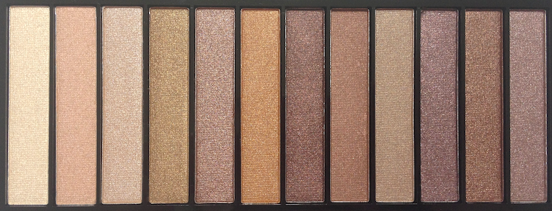
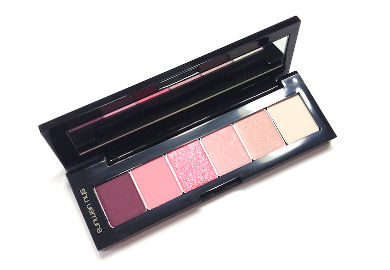
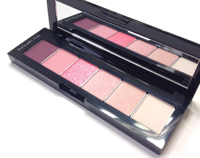
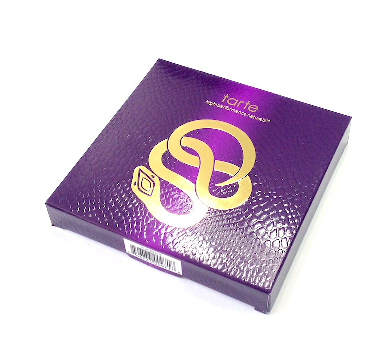
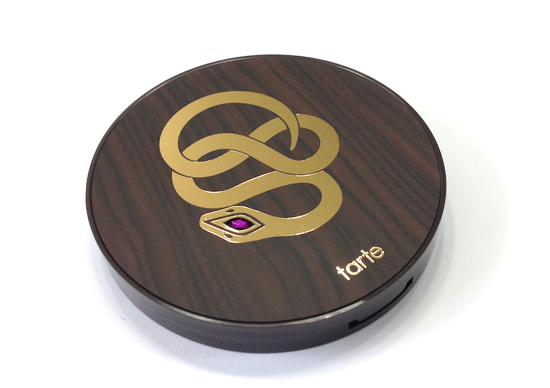
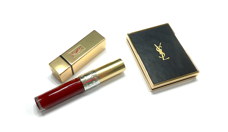
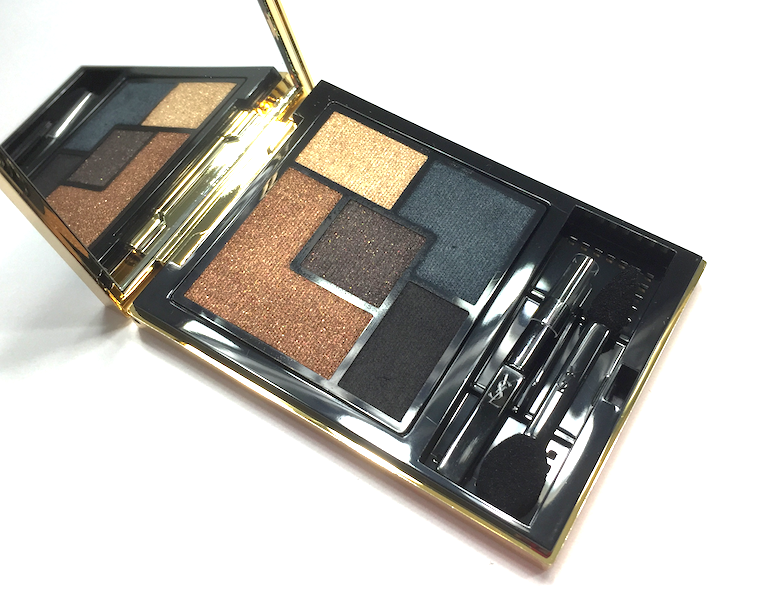
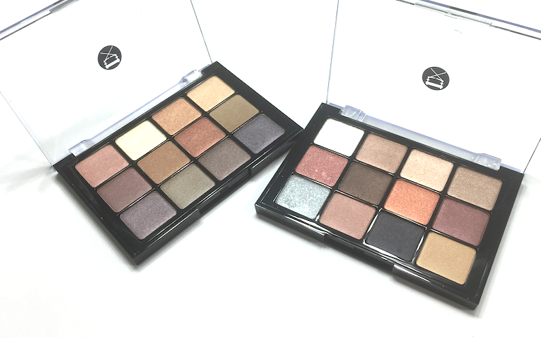
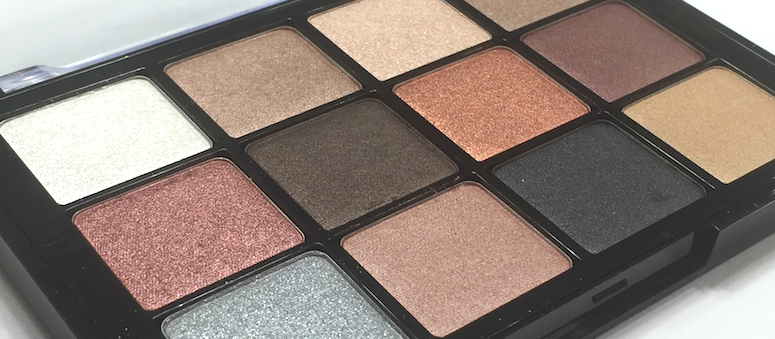
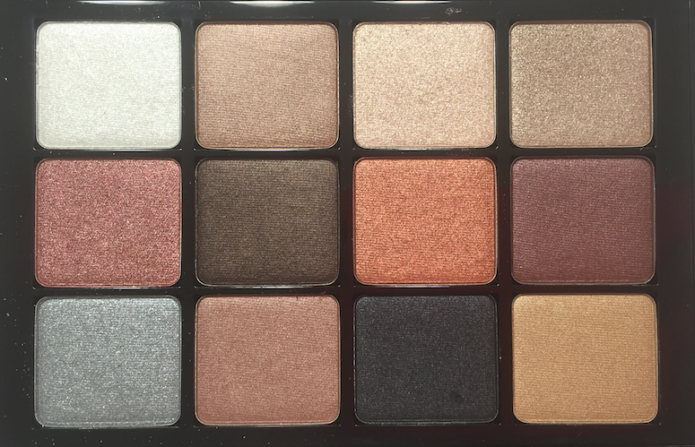
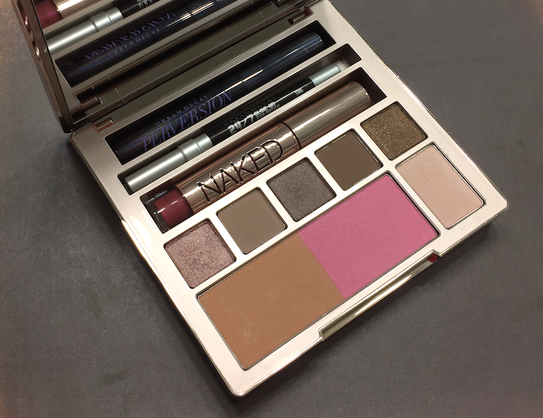
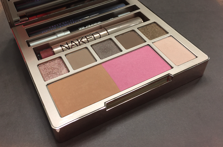
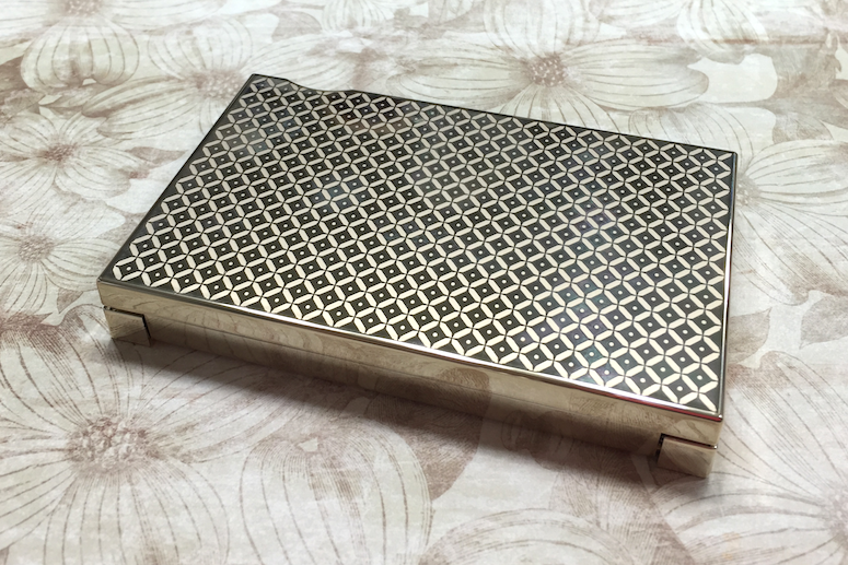
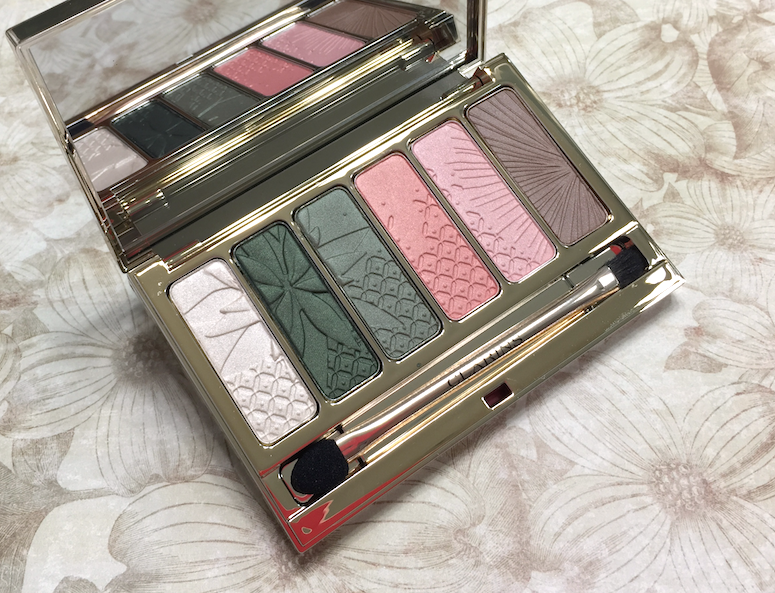
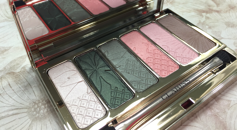
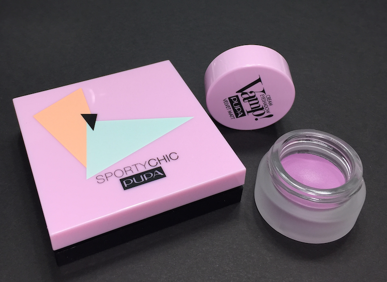
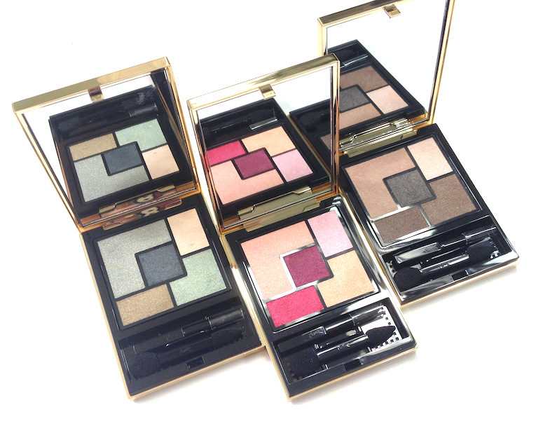
The packaging and style here is classic YSL - gold metallic casing, simple, elegant, graphic layout. Most of the palettes have a monochromatic theme, though a couple feature more vivid combinations.
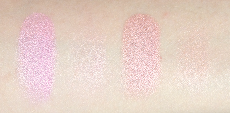
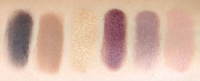
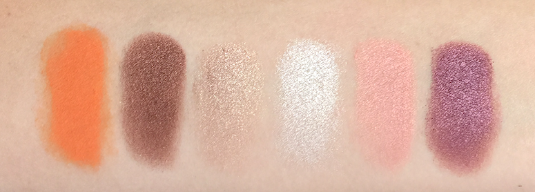
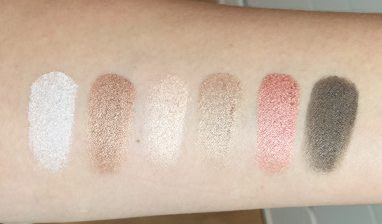
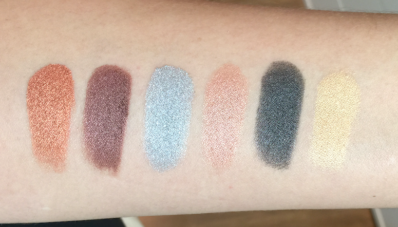
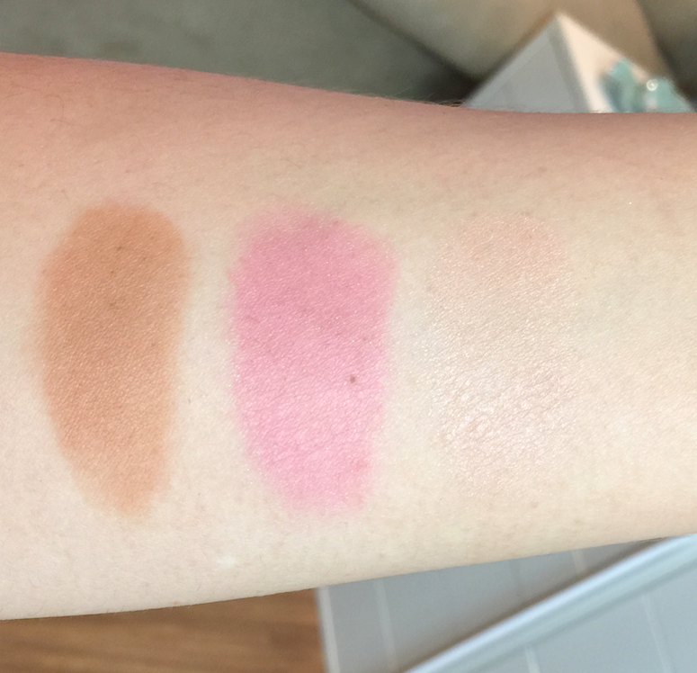
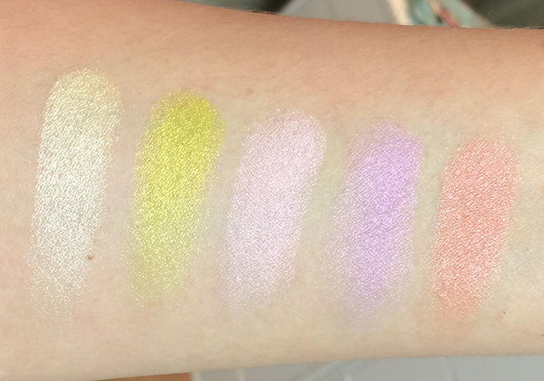
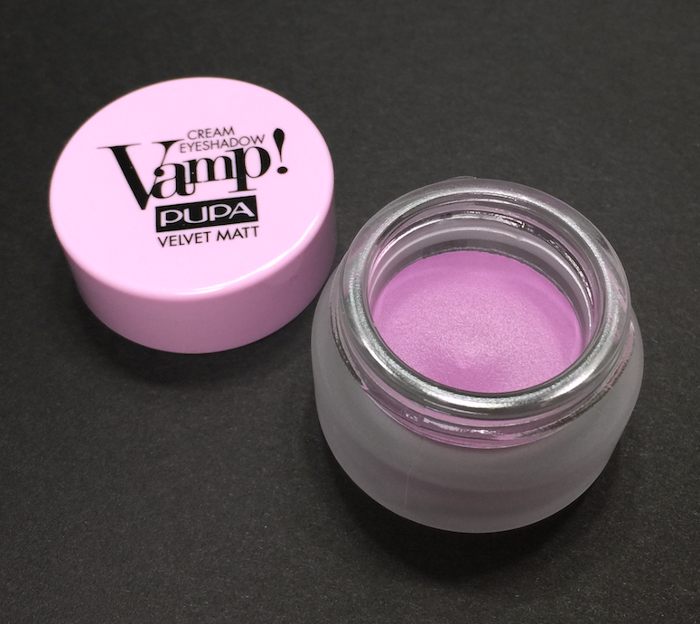
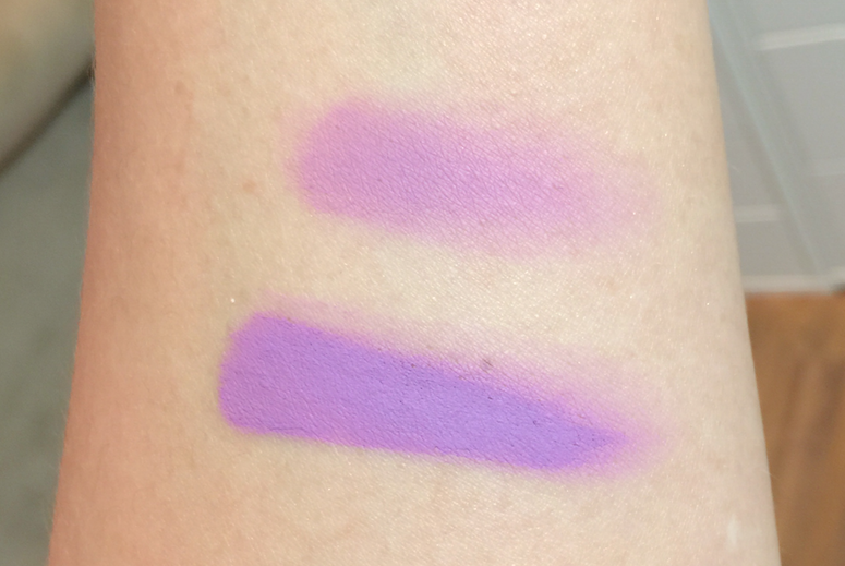
The actual formulation of the eyeshadows is where YSL has proven itself to be truly innovative. When I first touched these eyeshadows, they felt a little dry, and I was concerned. Upon swatching them, I was much relieved - they had some serious payoff. Swatches are one thing, however, and how a product applies to an actual human eyelid is another.
AND YOU GUYS.
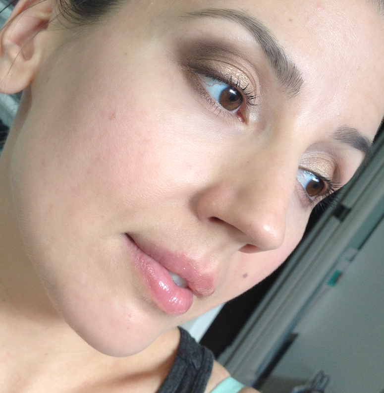
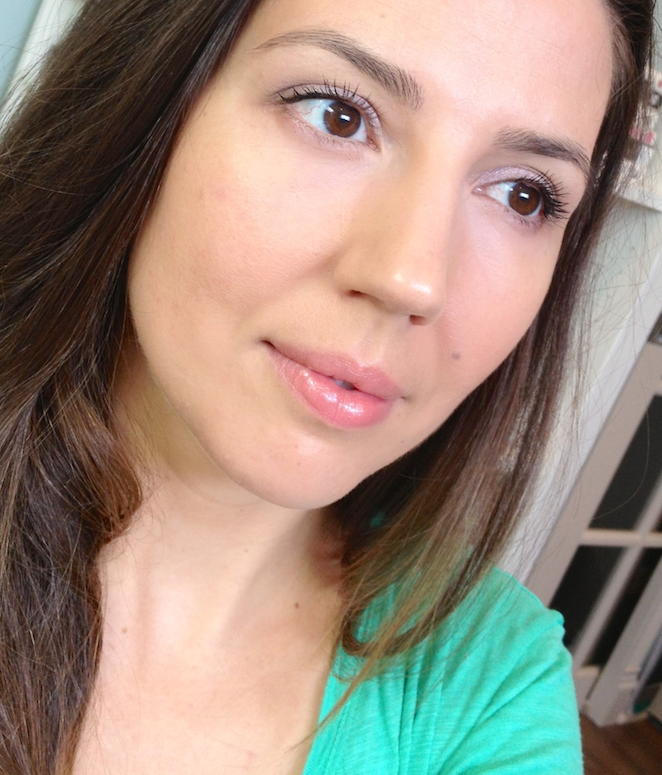
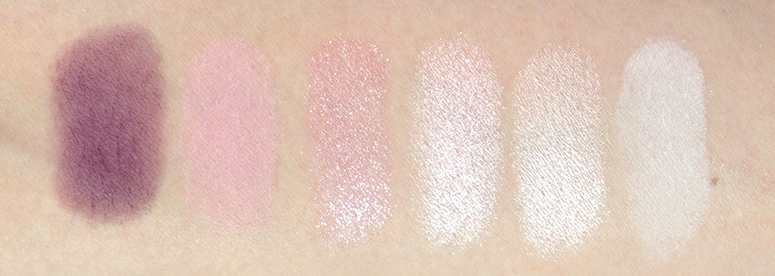
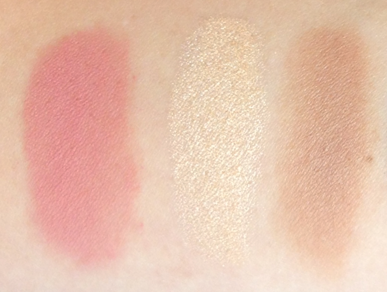
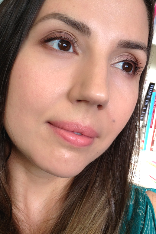
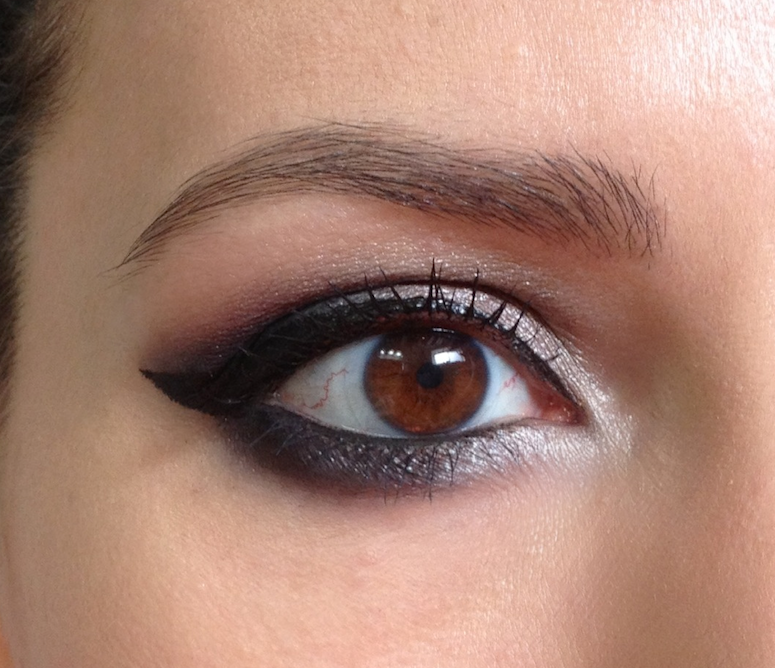
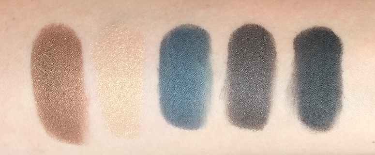
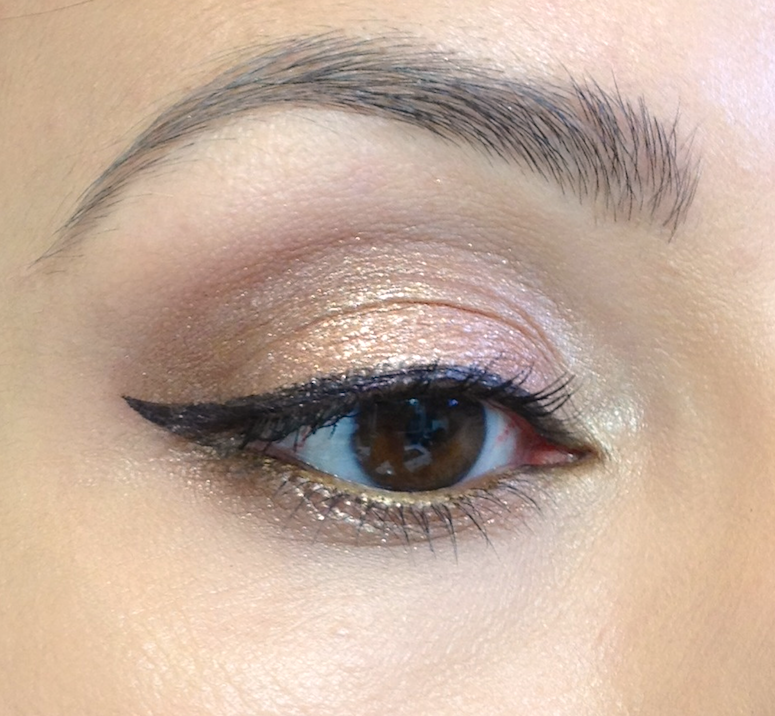
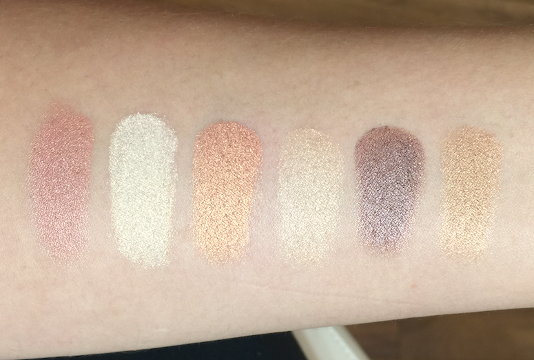
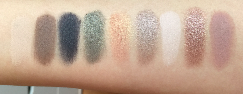
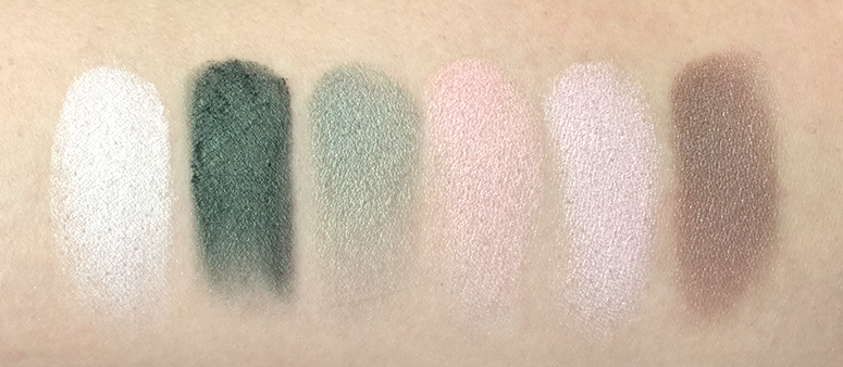
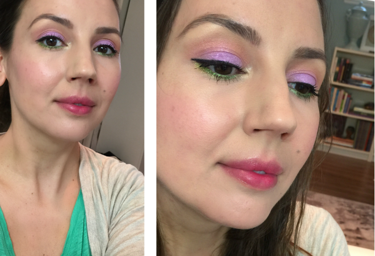
They looked on the eyelid exactly how they looked in the swatch. Not only that, they actually looked like do in the pan. They have some of the truest colour transfer I've ever seen. I applied these with my usual MAC paddle brush, and with just a tap into the pan I had a ton of product clinging to the brush hairs. There was a fair bit off powder kick back when I did so, but as long as I tapped my brush off, I had no fallout when I applied it. All the shades went on true and vibrant, and blended out well, without sheering out too quickly. What seemed a little dry in the pan actually felt smooth and silky when used.
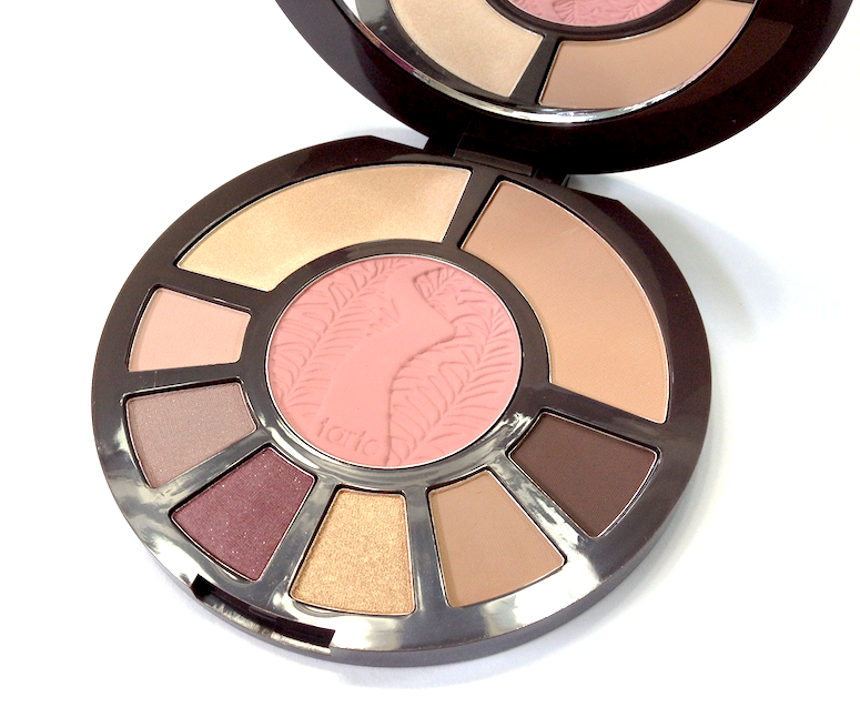
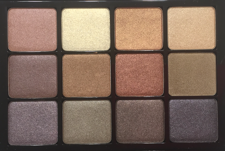
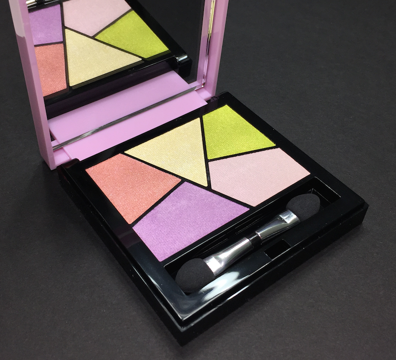
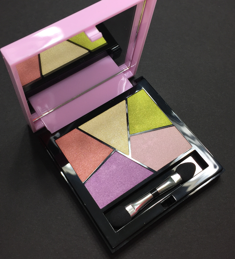
Each palette has a mix of satin and shimmer/microsparkle shades - the finishes vary subtly from shade to shade, with the darker eyeshadows in #02 Fauves having the most matte-leaning finish out of the the ones I've tried. The satin shades all have strongest pigmentation levels, while the shimmer/microsparkle shades are initially a little sheerer, though buildable. The sparkle is extremely refined, lending a beautiful, sunlight-on-water type of liquid shimmer to the eye. They can be applied all over the eyelid, overtop another shade for greater dimension, or just in the inner corner for an amazing highlight.
The wear time on these is very good, with no sign of fading or creasing after 8-10 hours over my usual primer. As far as downsides, other than that bit of powder kick-back to watch out for, I can only think of the value ratio, as they are quite spend for the amount of product you're getting. That said, I think the texture is unique enough, and I don't see any immediate dupes.
![YSL Couture Palette - #02 Fauves, #08 Avant Garde, #09 Rose Baby Doll]()
![]()
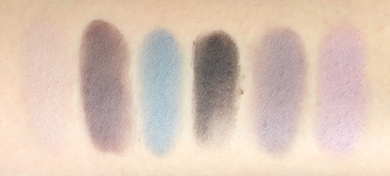
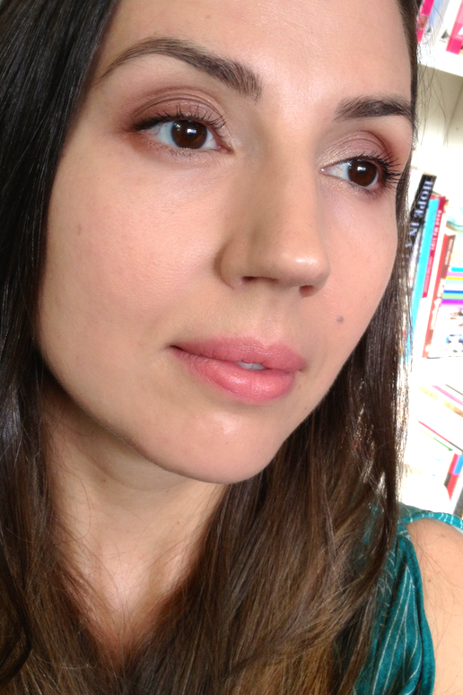
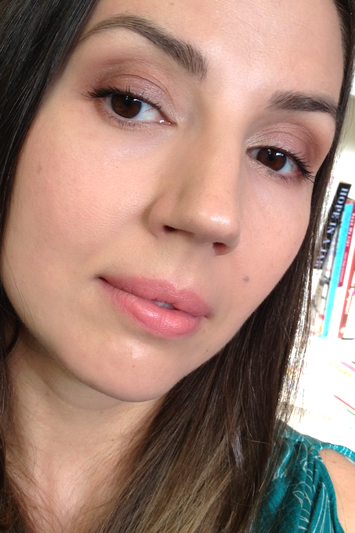
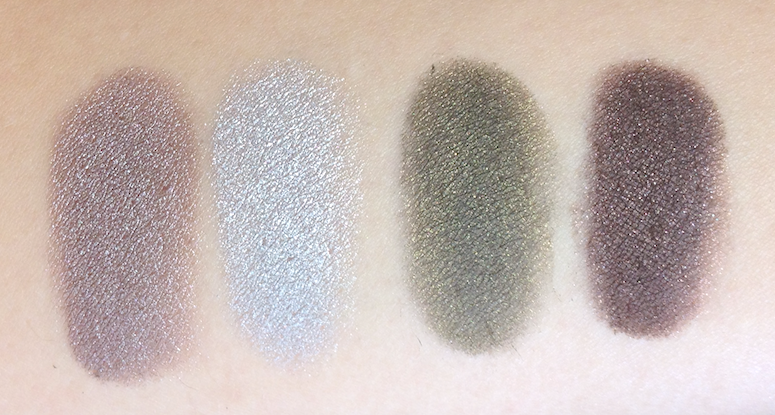
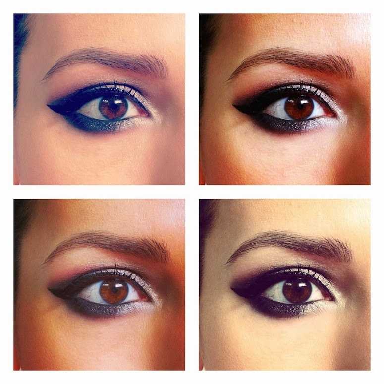
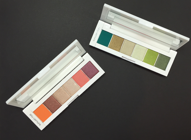
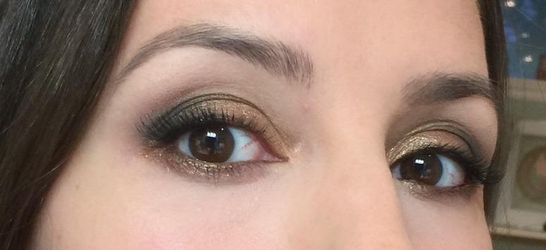
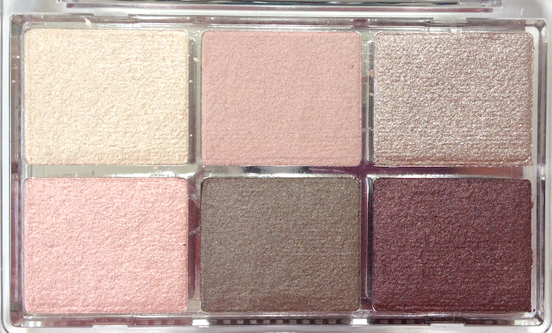
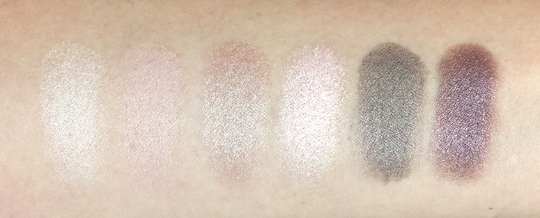
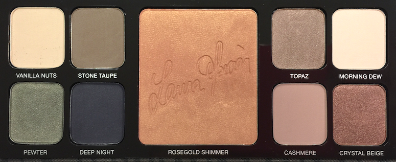
The #02 Fauves is fantastic, especially for those looking for a workday staple. It's spot-on neutral, leaning neither warm or cool. The dusty camel shade at the top left works perfectly all over the lid, or as a blending/transition colour, depending on your skin tone. The three brown shades provided varying levels of intensity of creating a defined crease, lash line or soft smoky effect. I do wish there was a bit more variation between the middle two browns, but other than that, I really can't complain. This has become my default everyday palette.
![YSL Couture Palette - #02 Fauves, #08 Avant Garde, #09 Rose Baby Doll]()
![YSL Couture Palette - #02 Fauves, #08 Avant Garde, #09 Rose Baby Doll]()
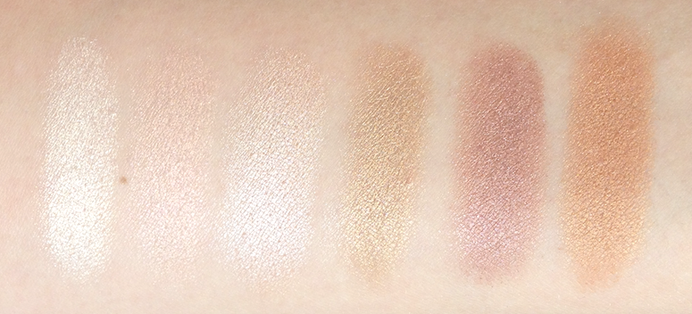
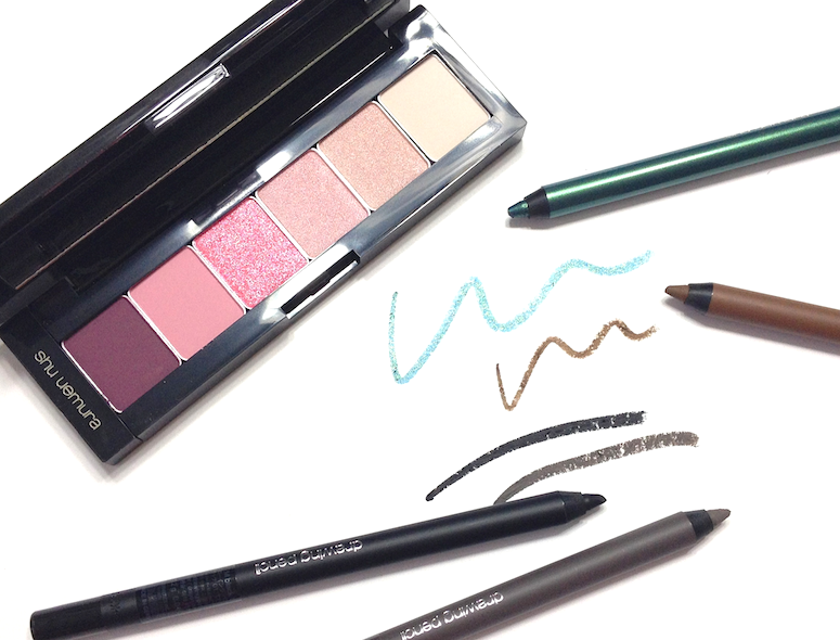
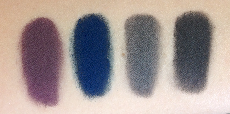
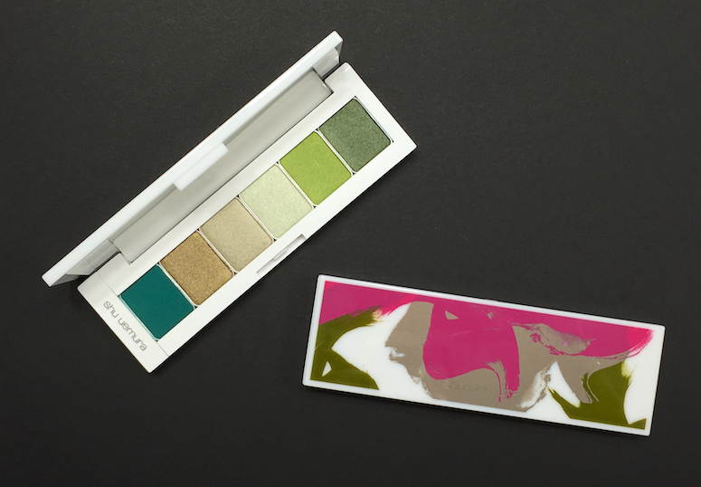
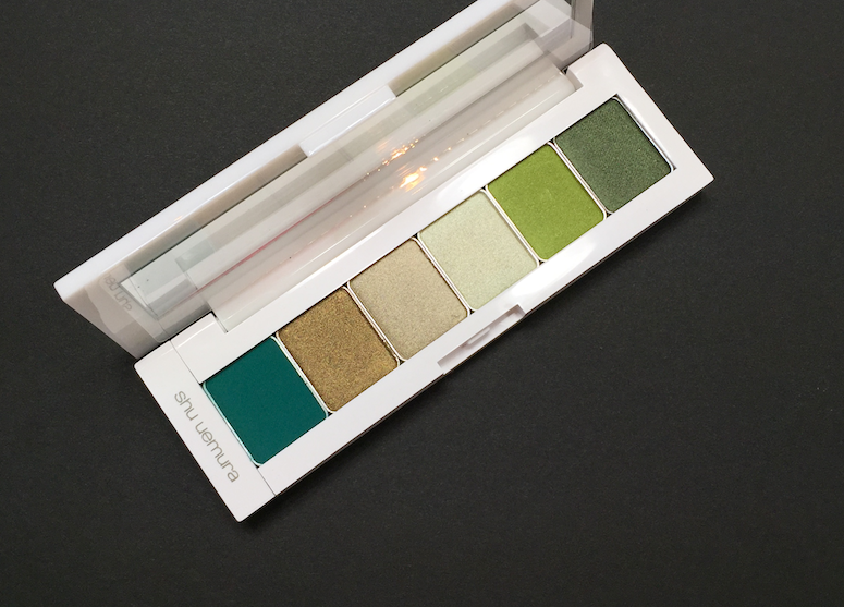
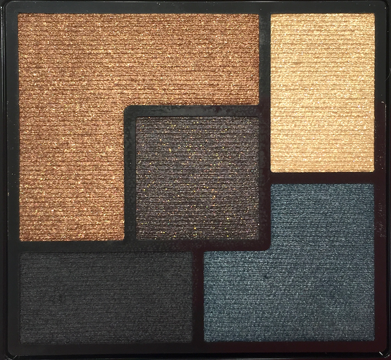
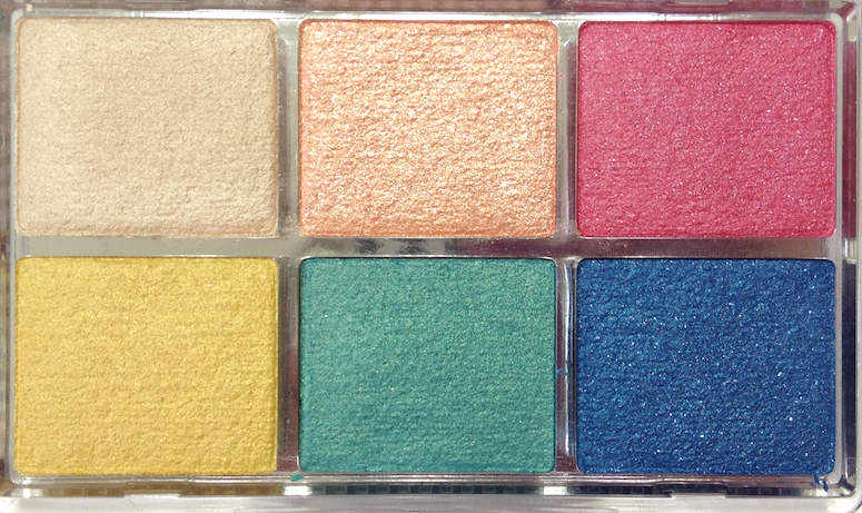
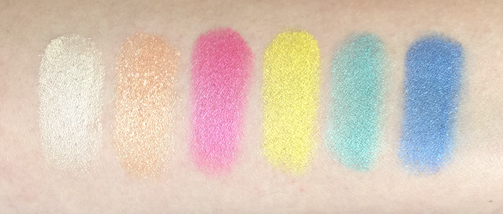
I loooooove green (makes the chestnut in my brown eyes more apparent), and the #08 Avant Garde does not disappoint. I was a little perplexed by the olive green in the bottom left, as it seems so incongruous with the other, cooler leaning tones, but when used together, the look is dimensional, not discordant. That blackened green in the middle is also an awesome eyeliner. The only downside to this palette is that it doesn't appear to be available in-store at Sephora, though it is orderable.
![YSL Couture Palette - #02 Fauves, #08 Avant Garde, #09 Rose Baby Doll]()
![YSL Couture Palette - #02 Fauves, #08 Avant Garde, #09 Rose Baby Doll]()
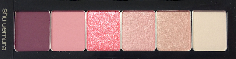
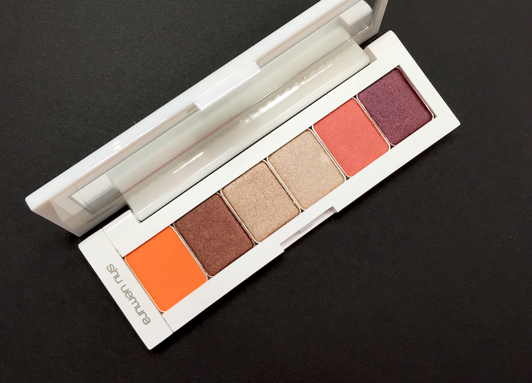
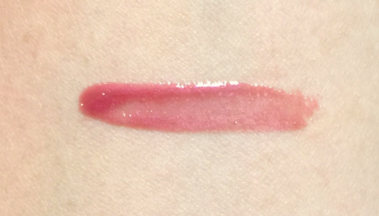
The #09 Rose Baby Doll was a whimsical purchase. I don't what it is about hot pink that draws me in so much, but usually I limit it to lip shades. Somehow I got sucker punched by this one. I....am still figuring it out. That hot pink is just SO VIBRANT. I do kind of wish there was another mid-tone shade in there instead of one of the peach or pink shimmer shades, since they're quite similar. Then again, they're also both so pretty, it's hard for me to complain.
Availability: At Sephora stores and www.sephora.com, as well as counters at Holt Renfrew and Hudson's Bay, and www.thebay.com. If you're stateside, they can also be ordered on www.yslbeautyus.com. Price is 60$ USD and 64$ CAD.
I'm quite impressed by the Couture Palettes, and I know I'll be adding more to my collection soon. How do you guys feel about them?
(The #02 Fauves was provided by the brand/PR to be considered for review. I purchased the other two palettes. All opinions are my own, this post is not sponsored or compensated.)
If you're in the latter camp, and have since written off the YSL eyeshadow offerings, I would urge you to take a look at their new Couture Palettes. They are really something else.
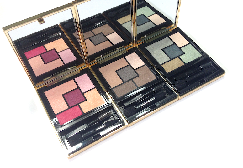
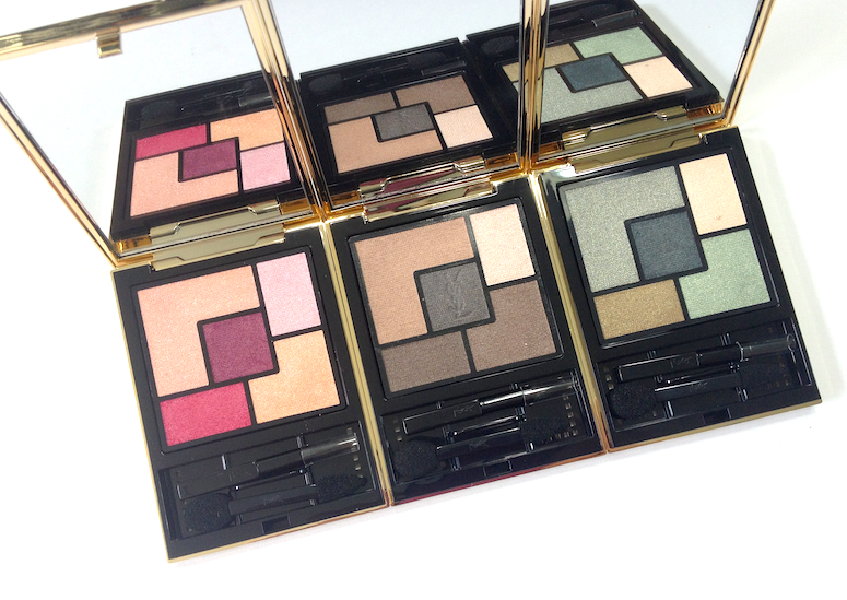

The packaging and style here is classic YSL - gold metallic casing, simple, elegant, graphic layout. Most of the palettes have a monochromatic theme, though a couple feature more vivid combinations.
The actual formulation of the eyeshadows is where YSL has proven itself to be truly innovative. When I first touched these eyeshadows, they felt a little dry, and I was concerned. Upon swatching them, I was much relieved - they had some serious payoff. Swatches are one thing, however, and how a product applies to an actual human eyelid is another.
AND YOU GUYS.
They looked on the eyelid exactly how they looked in the swatch. Not only that, they actually looked like do in the pan. They have some of the truest colour transfer I've ever seen. I applied these with my usual MAC paddle brush, and with just a tap into the pan I had a ton of product clinging to the brush hairs. There was a fair bit off powder kick back when I did so, but as long as I tapped my brush off, I had no fallout when I applied it. All the shades went on true and vibrant, and blended out well, without sheering out too quickly. What seemed a little dry in the pan actually felt smooth and silky when used.
Each palette has a mix of satin and shimmer/microsparkle shades - the finishes vary subtly from shade to shade, with the darker eyeshadows in #02 Fauves having the most matte-leaning finish out of the the ones I've tried. The satin shades all have strongest pigmentation levels, while the shimmer/microsparkle shades are initially a little sheerer, though buildable. The sparkle is extremely refined, lending a beautiful, sunlight-on-water type of liquid shimmer to the eye. They can be applied all over the eyelid, overtop another shade for greater dimension, or just in the inner corner for an amazing highlight.
The wear time on these is very good, with no sign of fading or creasing after 8-10 hours over my usual primer. As far as downsides, other than that bit of powder kick-back to watch out for, I can only think of the value ratio, as they are quite spend for the amount of product you're getting. That said, I think the texture is unique enough, and I don't see any immediate dupes.
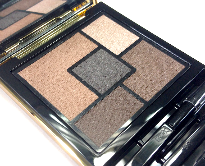

The #02 Fauves is fantastic, especially for those looking for a workday staple. It's spot-on neutral, leaning neither warm or cool. The dusty camel shade at the top left works perfectly all over the lid, or as a blending/transition colour, depending on your skin tone. The three brown shades provided varying levels of intensity of creating a defined crease, lash line or soft smoky effect. I do wish there was a bit more variation between the middle two browns, but other than that, I really can't complain. This has become my default everyday palette.
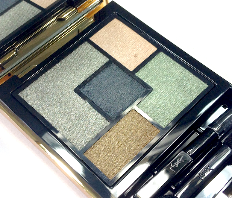

I loooooove green (makes the chestnut in my brown eyes more apparent), and the #08 Avant Garde does not disappoint. I was a little perplexed by the olive green in the bottom left, as it seems so incongruous with the other, cooler leaning tones, but when used together, the look is dimensional, not discordant. That blackened green in the middle is also an awesome eyeliner. The only downside to this palette is that it doesn't appear to be available in-store at Sephora, though it is orderable.
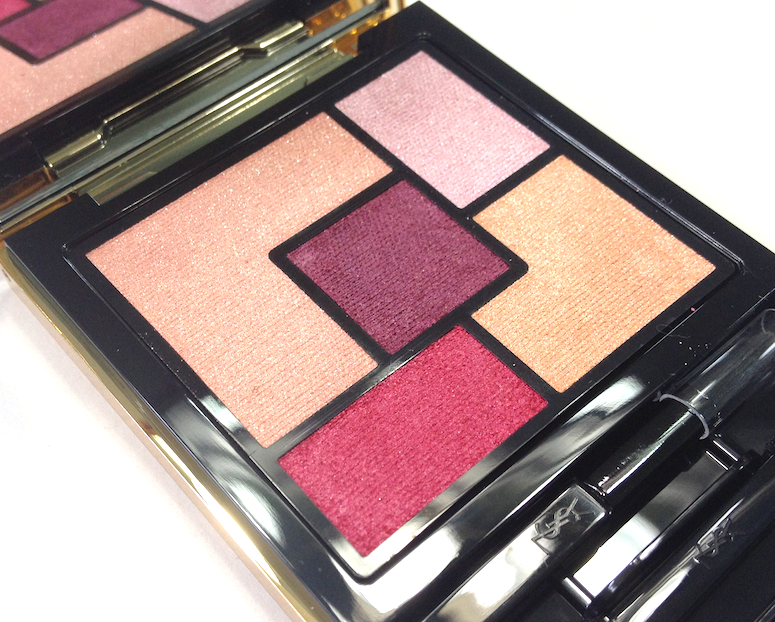
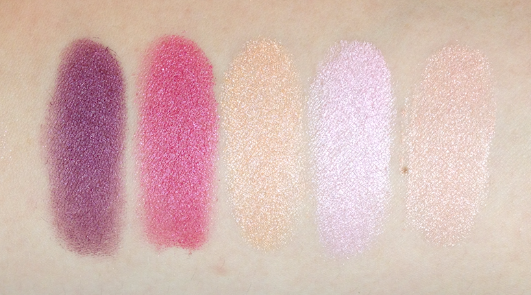
The #09 Rose Baby Doll was a whimsical purchase. I don't what it is about hot pink that draws me in so much, but usually I limit it to lip shades. Somehow I got sucker punched by this one. I....am still figuring it out. That hot pink is just SO VIBRANT. I do kind of wish there was another mid-tone shade in there instead of one of the peach or pink shimmer shades, since they're quite similar. Then again, they're also both so pretty, it's hard for me to complain.
Availability: At Sephora stores and www.sephora.com, as well as counters at Holt Renfrew and Hudson's Bay, and www.thebay.com. If you're stateside, they can also be ordered on www.yslbeautyus.com. Price is 60$ USD and 64$ CAD.
I'm quite impressed by the Couture Palettes, and I know I'll be adding more to my collection soon. How do you guys feel about them?
(The #02 Fauves was provided by the brand/PR to be considered for review. I purchased the other two palettes. All opinions are my own, this post is not sponsored or compensated.)