Like Alton Brown, I love an item that serves more than one function. The Marcelle Velvety Eye Shadow and Primer claims to do just that, all while providing creaseless, waterproof wear for 12 hours or more.
![Marcelle Velvety Eye Shadow and Primer - Primer Rose]()
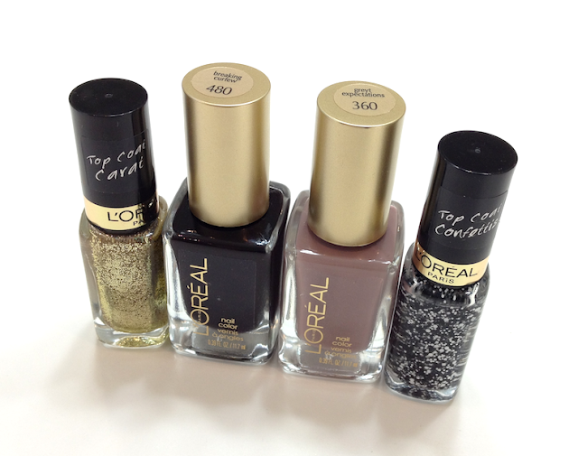
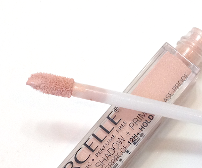
The packaging is sleek, simple and practical, with a doe-foot applicator to dap on the product where needed and a transparent tube to see exactly how much product is left.
![Marcelle Velvety Eye Shadow and Primer - Primer Rose]()
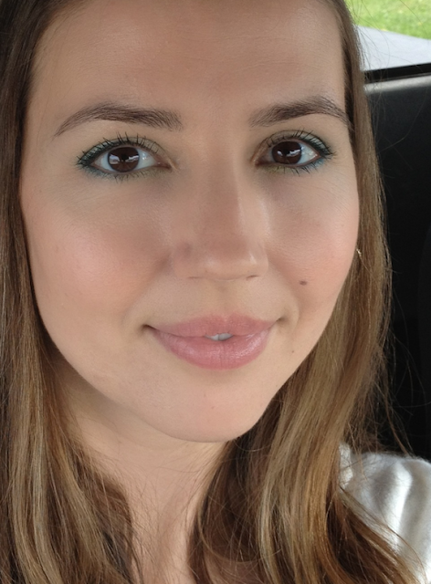
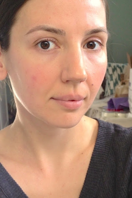
Using this all over the lid with just a touch of medium brown or taupe in the crease is also an incredibly fast and easy way to look polished and work-ready.
![Marcelle Velvety Eye Shadow and Primer - Primer Rose]()
![Marcelle Velvety Eye Shadow and Primer - Primer Rose]()
I'm really pleased by how well this performed and how flattering it looked. It reminds me a bit of the Vincent Longo Liquid Shadows, except that those crease tragically and need a separate primer to be useable. This particular shade was sent to me, but I will be picking up the Chameleon and Velvety Beige shades very soon!
Availability: At most drugstores, as well as from the Marcelle website. Price is 15.95$ CAD and USD.
Pros: Long-wearing without creasing or fading. Natural, flattering shade, works well as both a primer and an eyeshadow.
Cons: None that I can think of, aside from maybe that initial feeling as the product sets.
(The item was sent to me by the brand to consider for review. This post is not sponsored or compensated.)

The packaging is sleek, simple and practical, with a doe-foot applicator to dap on the product where needed and a transparent tube to see exactly how much product is left.
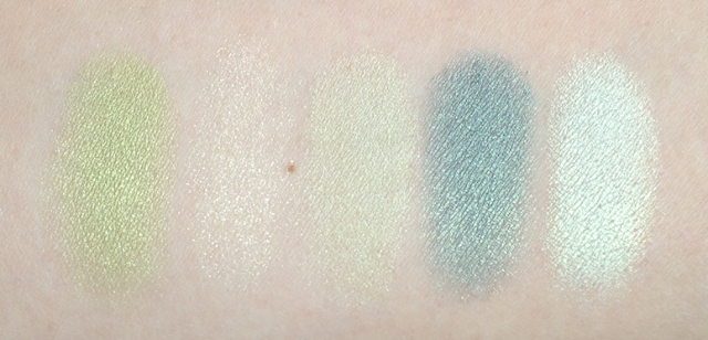
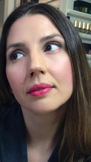
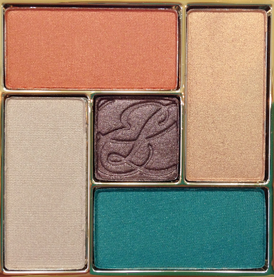
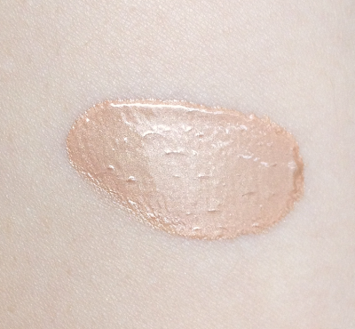
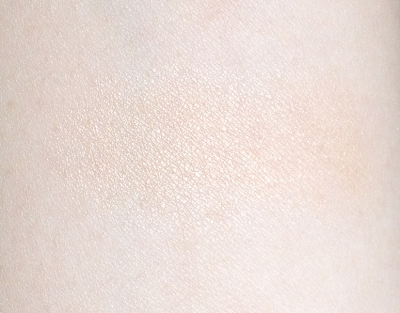
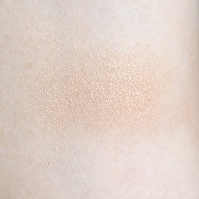
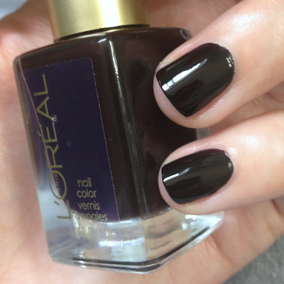
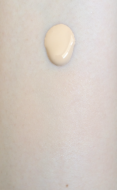
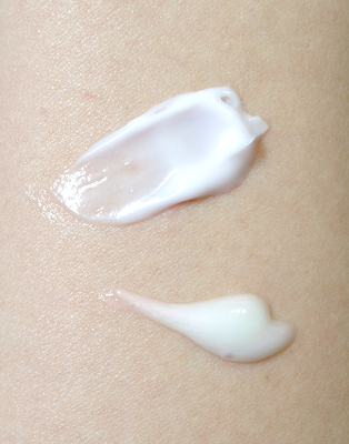
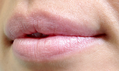
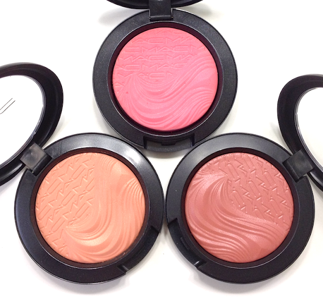
This is truly both a primer and a liquid-to-powder eyeshadow. This particular shade is a pale, shimmery pink-beige that covers redness and discolouration while adding a natural blush tone and shimmer to the lid. It has a thinner, wetter texture compared to something like Urban Decay Primer Potion, which is more creamy-silicone. The Marcelle Eye Shadow and Primer feels more liquid initially, and seems to feel that way on the lid for a good 15 seconds, even though it's not actually fluid anymore. It's a little disconcerting, but it does dry to a perfectly set powder finish, no tackiness or budging. This wore the promised 12 hours without fading or creasing, both by itself and as a base under powder eyeshadow.
Using this all over the lid with just a touch of medium brown or taupe in the crease is also an incredibly fast and easy way to look polished and work-ready.
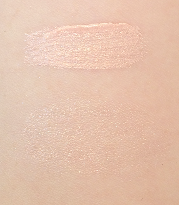
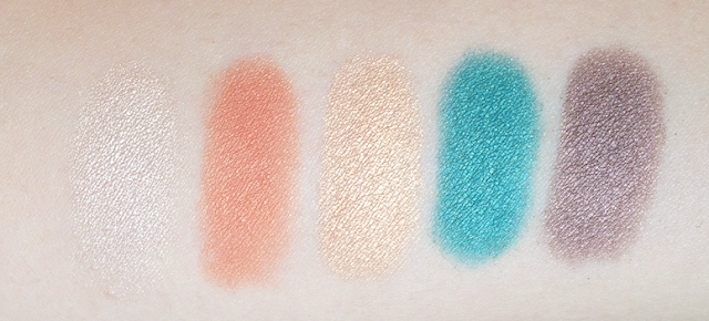
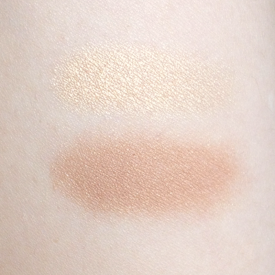
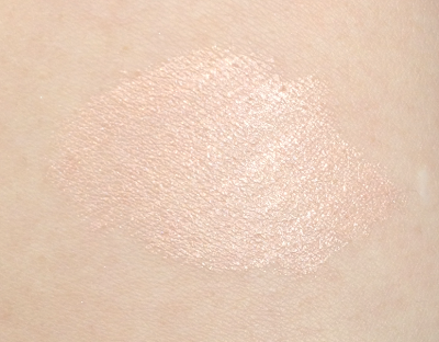
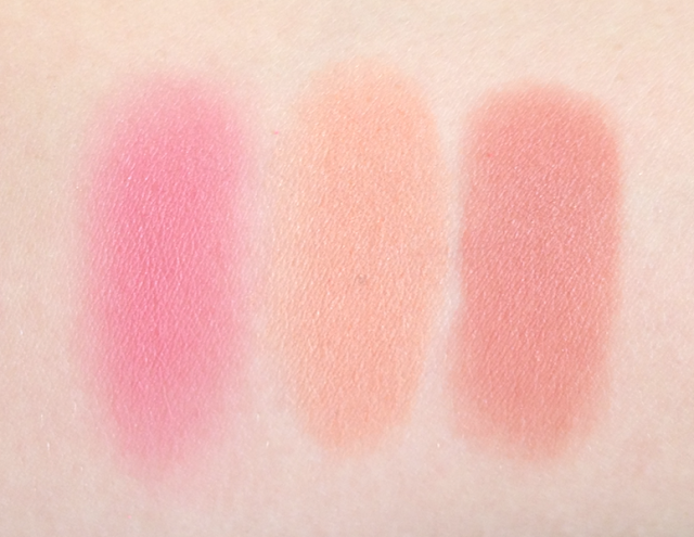
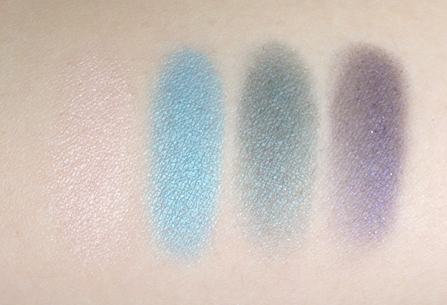
The swatches above show what it's like swiped directly from the tube and then sheered out a fair bit with a finger. The swatch below is a blended in but not sheered out, and you can see the gorgeous shimmer.
I'm really pleased by how well this performed and how flattering it looked. It reminds me a bit of the Vincent Longo Liquid Shadows, except that those crease tragically and need a separate primer to be useable. This particular shade was sent to me, but I will be picking up the Chameleon and Velvety Beige shades very soon!
Availability: At most drugstores, as well as from the Marcelle website. Price is 15.95$ CAD and USD.
Pros: Long-wearing without creasing or fading. Natural, flattering shade, works well as both a primer and an eyeshadow.
Cons: None that I can think of, aside from maybe that initial feeling as the product sets.
(The item was sent to me by the brand to consider for review. This post is not sponsored or compensated.)


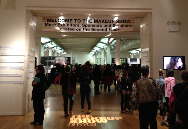
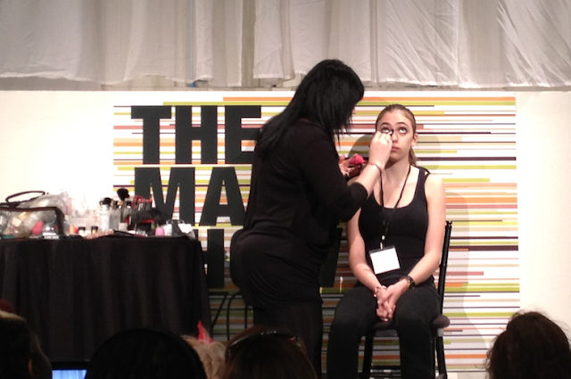
 Represent: Understanding the Relationship of Artist and Agent -Pati Dubroff & Brooke Wall
 Iconic Artistry-Gina Brooke Sponsored by Make Up For Ever
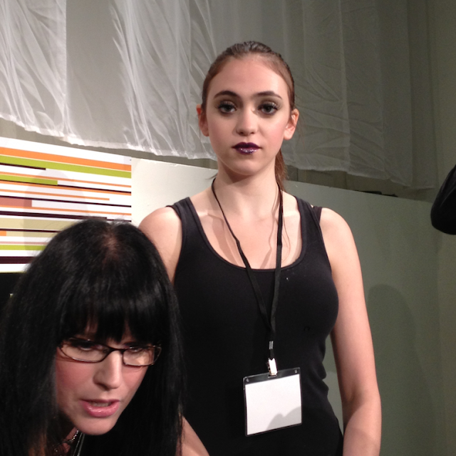
 Humanizing Glamour: The Art of Transformation with
  Impact: Social Media and the Internet in the Beauty Business
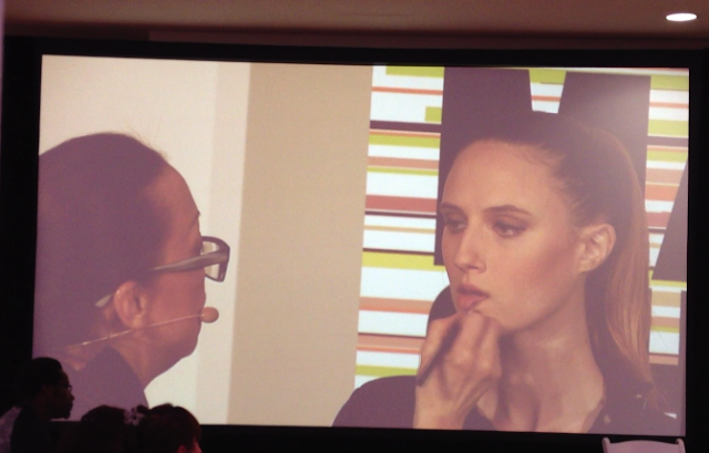
 Behind the Scenes – Dick PageMonday, May 6 2013 – 2:00-3:30
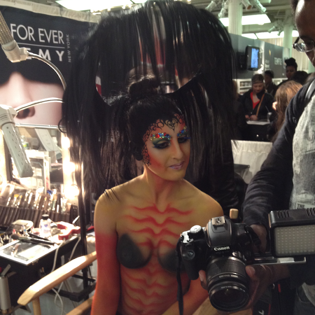
 Kit Focus: The Makeup Show Artists: James Vincent, Jon Hennessy and Orlando Santiago
 Red Carpet Revolution – Beau Nelson
 Building a Brand – Eve PearlSunday, May 5 2013 – 2:00-3:00Makeup Master, Brand Owner, Celebrity Artist, Educator and 5 time Emmy Award winner Eve Pearl has made a name for herself as one of the best in the business. As Creator and Founder of EVE PEARL she has managed to make her eponymous line a must have for makeup artists and enthusiast everywhere. In this exciting presentation Eve will share the story of how she started the EVE PEARL brand from the ground up (out of her apartment, with NO investors) and offer insight into the pros and cons of starting a makeup line. Listen in as Eve details how to develop and choose products that look and feel unique with innovative packaging and reveals some tips to set you apart from the thousands of makeup lines on the market. Eve will also discuss the impact of social media on the makeup business; disclose the best practices in strategic marketing give you some ideas on developing your own brand to help build your name and business. If you’ve ever dreamed of owning your own makeup brand this presentation is one you should not miss.
 The Next Big Thing – Crystal Wright and Michael DeVellisMonday, May 6 2013 – 1:00- 2:00